Clockout

Used Apps

Figma

Role

Product Designer

Description

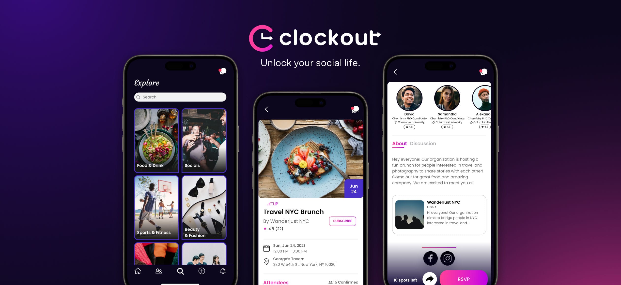
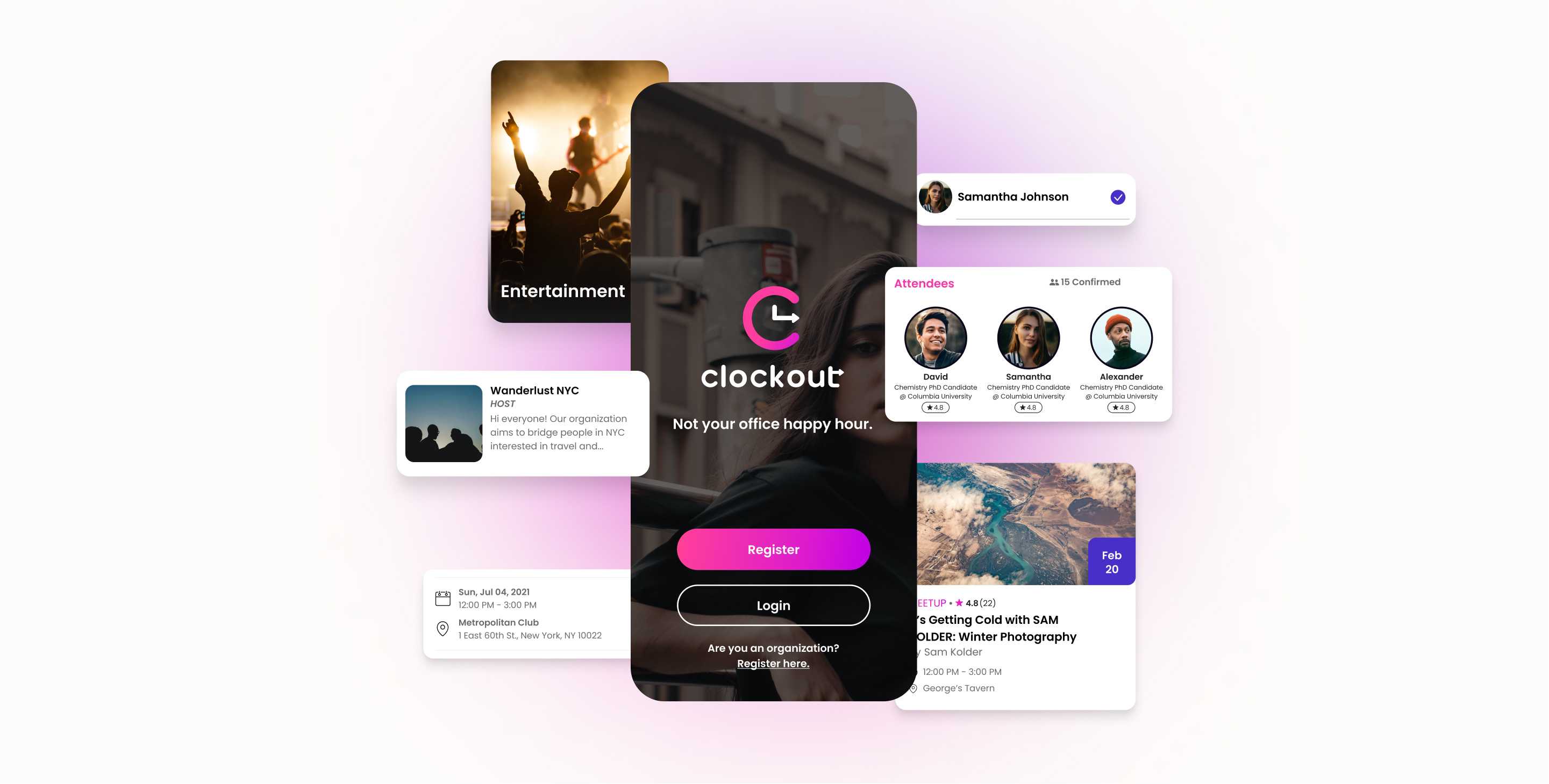
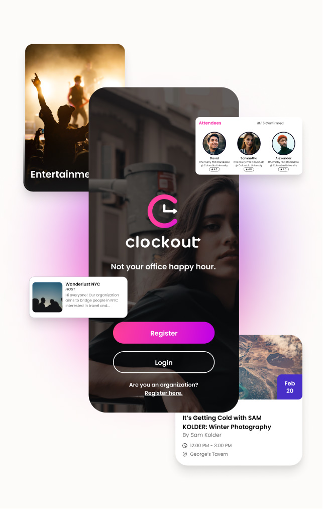
Clockout is made for post-grads and young professionals. The app is here so you can escape the grind and meet new people in ways that actually make sense.

Focus

  • App Design
  • User Experience
  • User Interface

Art Direction

We used purple, pink, and white as the main colors. We wanted to give a breath of fresh air to anyone who uses the app.
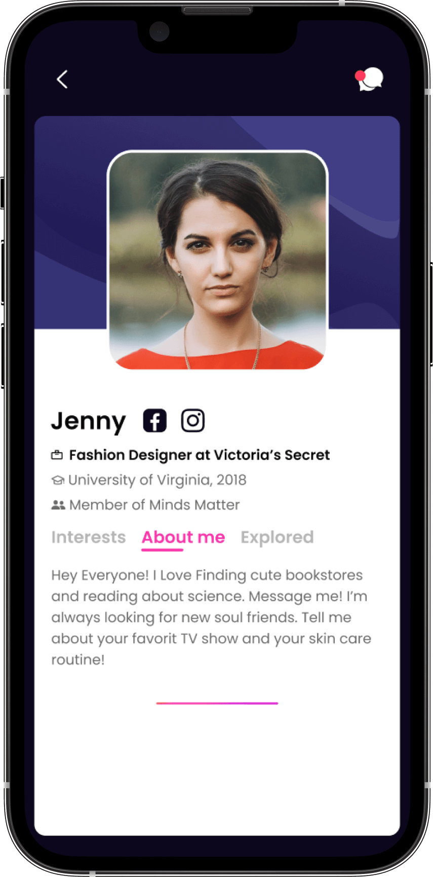
Best Experience Profile

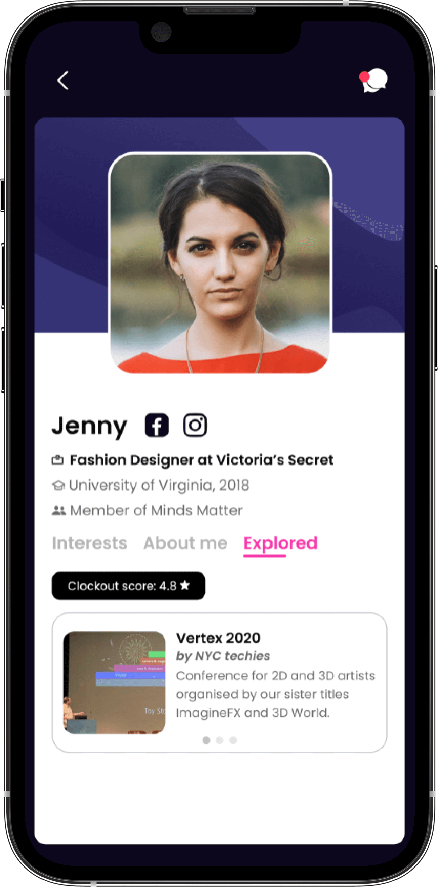
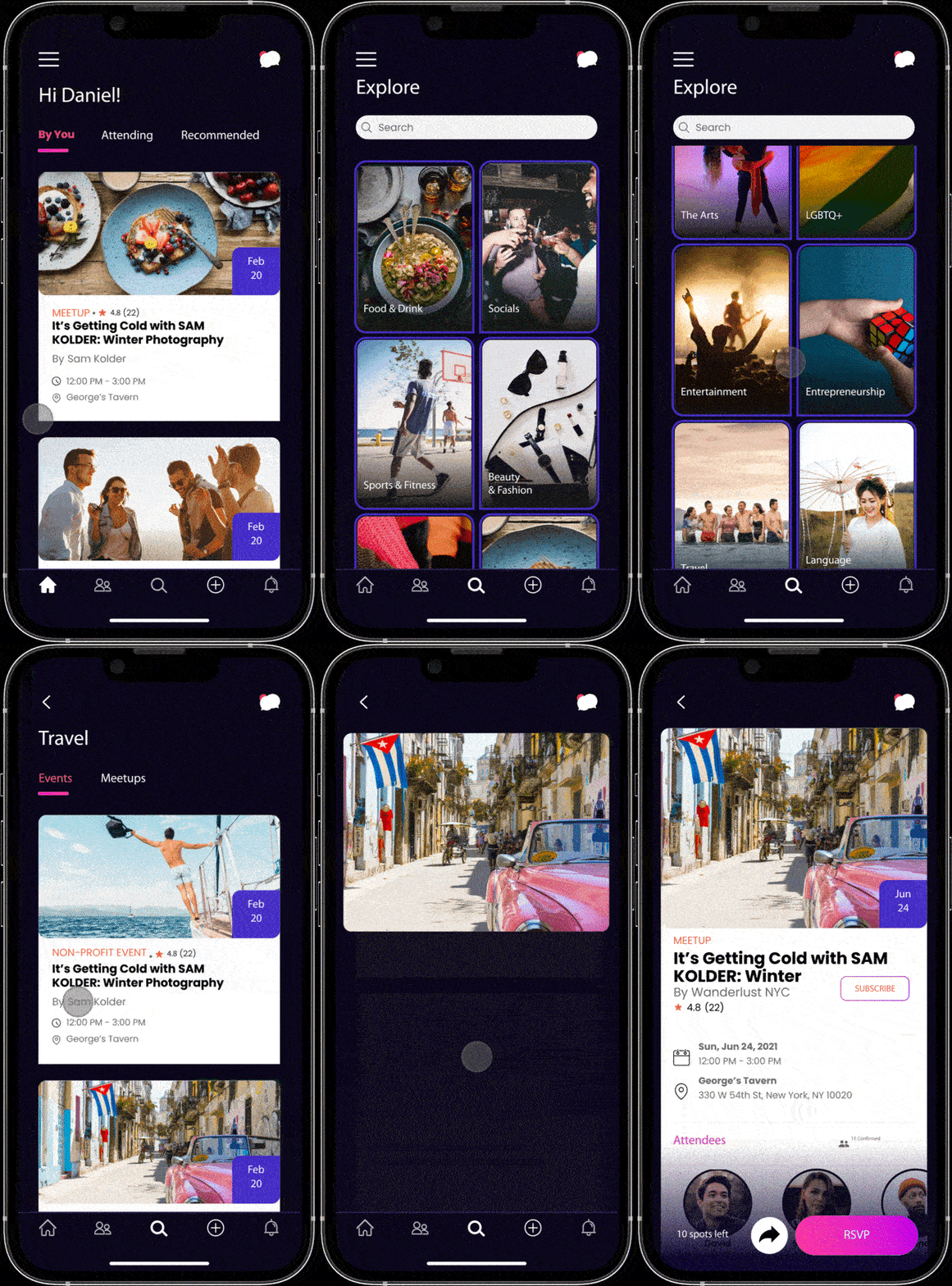
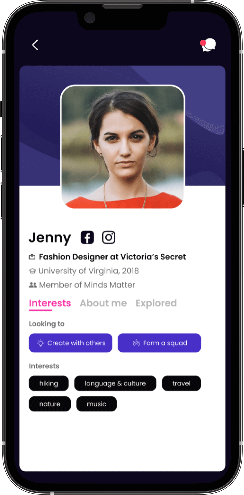
We wanted the interests of each member to be easy to spot, so deciding to connect with someone is effortless. You can also tap the waving hand icon to connect with a person, a more playful way to meet people.
Design by you

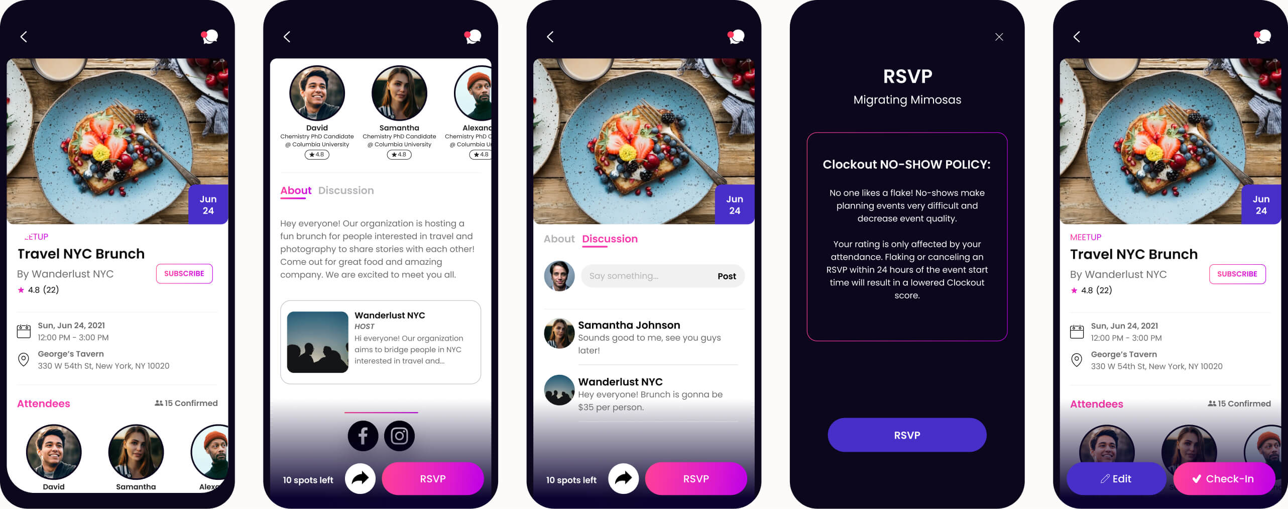
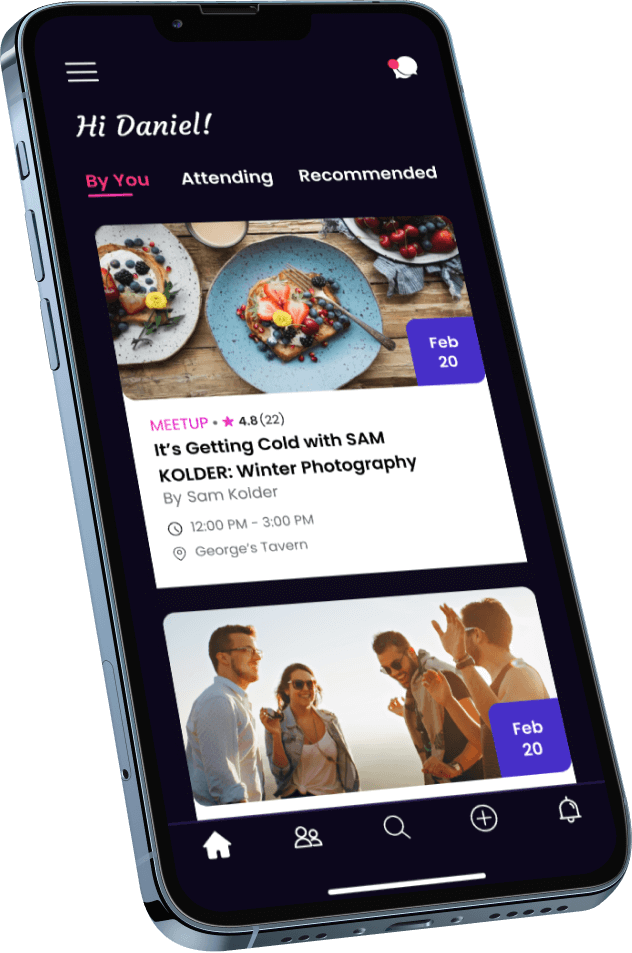
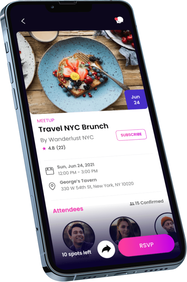
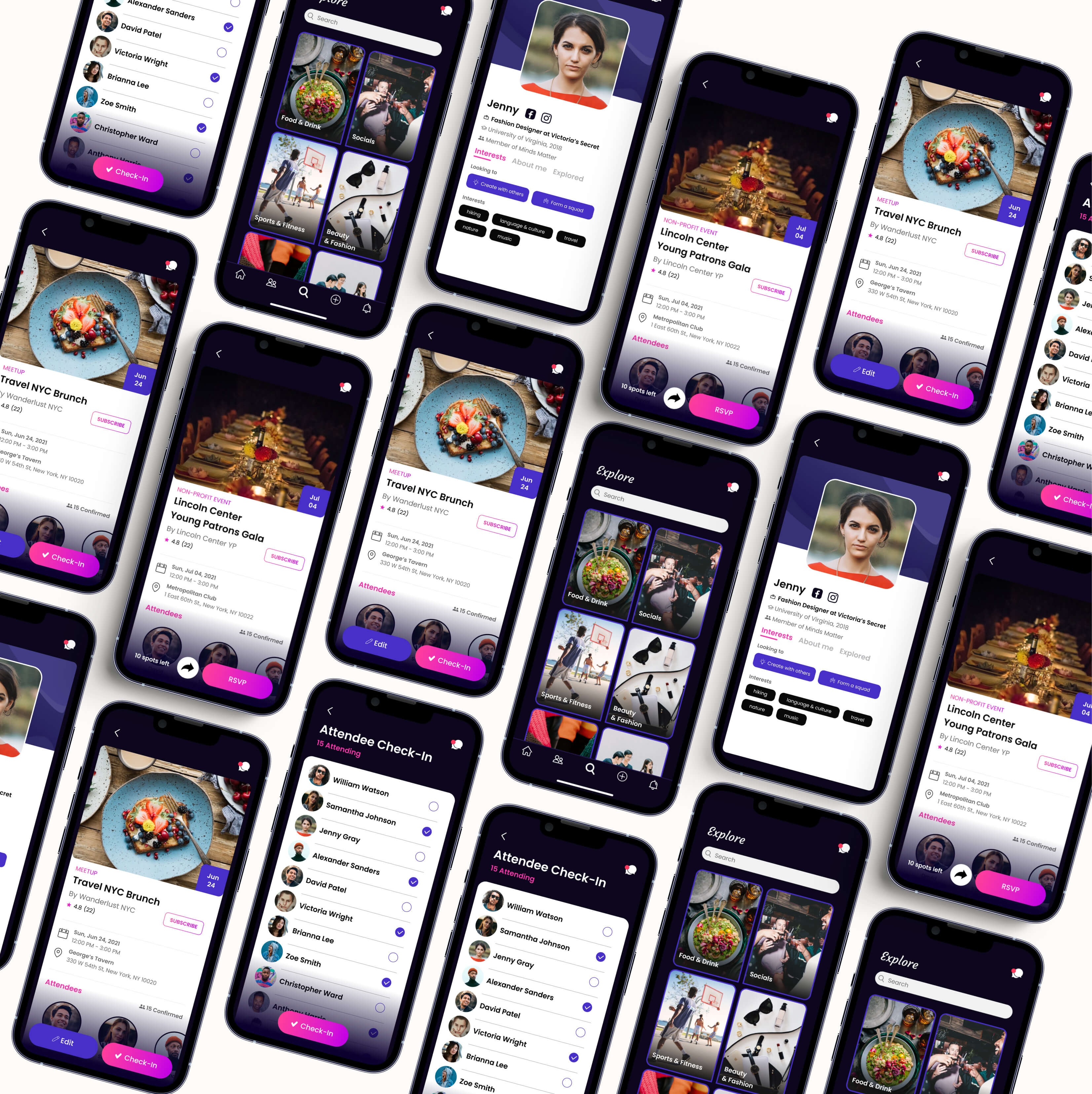
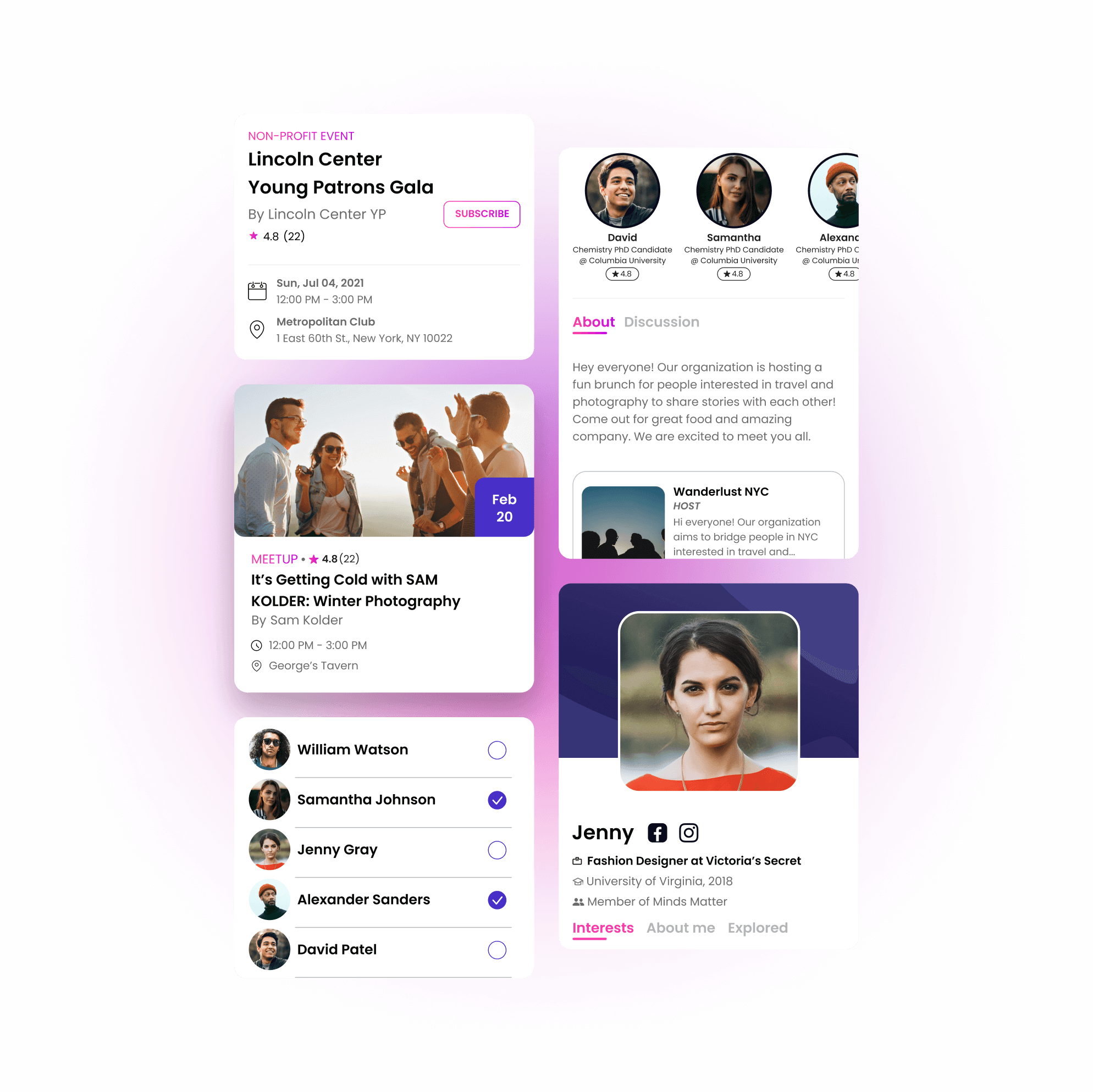
Clockout's design prioritizes user events. The app's home screen allows us to see our events, showing us the date, time, and place. It also motivates us to create our own events.

Your Events

The app allows us to see the events with all the data, such as day, time, place, and the list of attendees. In addition, it enables us to invite our friends and share events on our social networks.

Explore

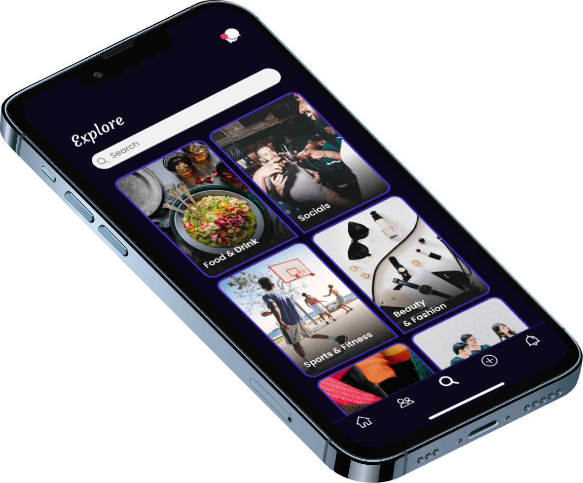
If we do not have scheduled events, we will always have the option to explore, which gives us an extensive list. So there will be no problems finding events to attend.

Parcel Tracking

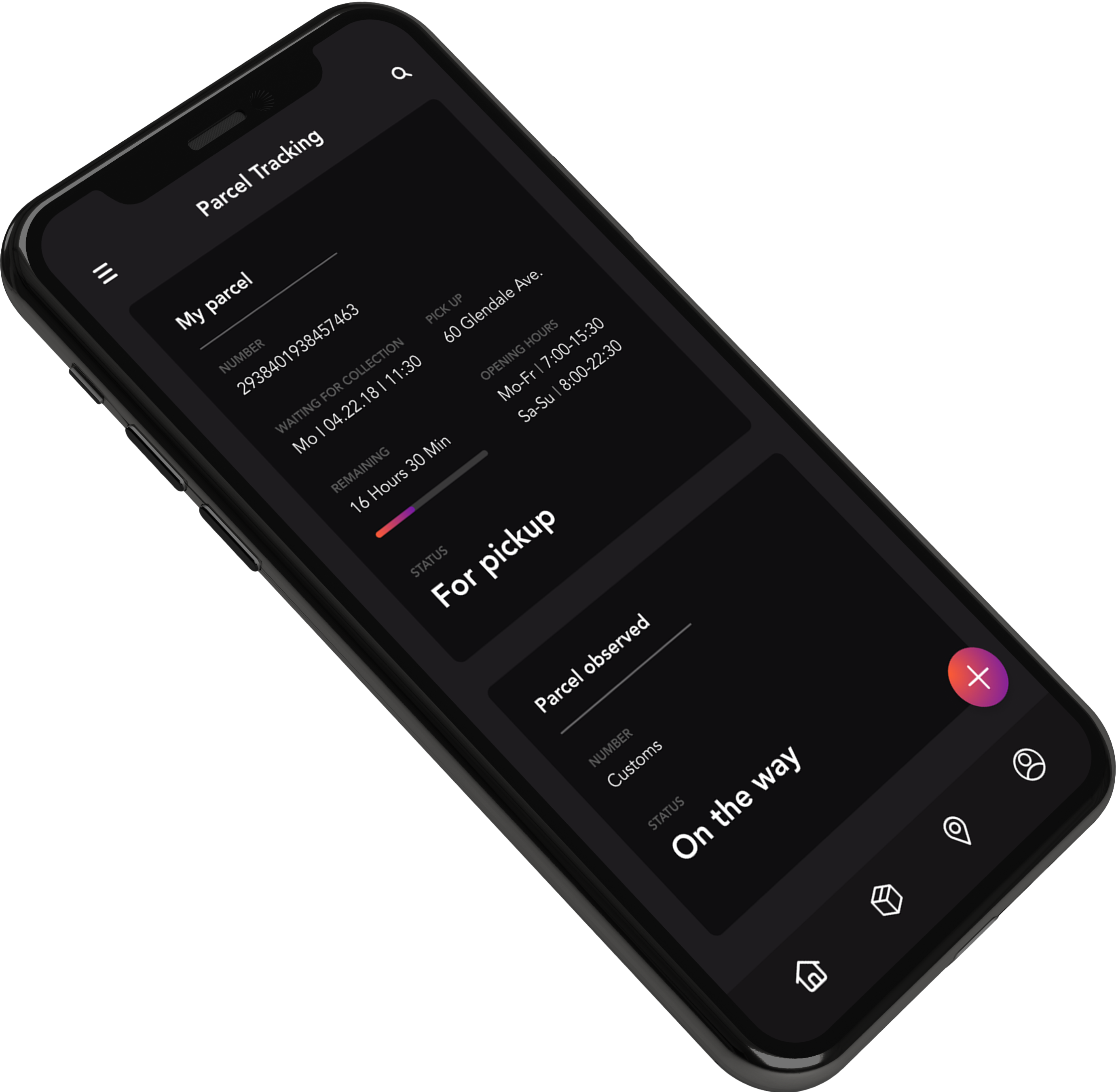
We wanted to show the most relevant information for the delivery process.

Calendar

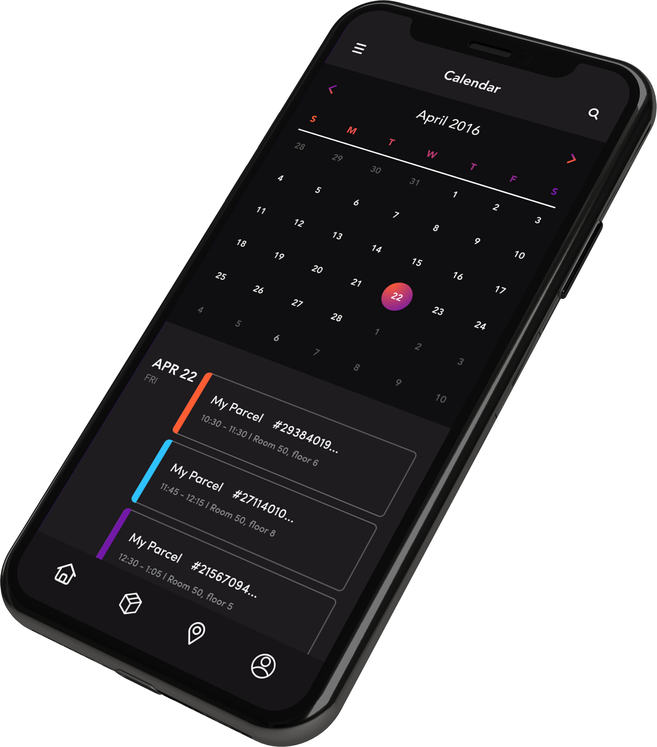
After some user testing, we understood that the user is more focused on the parcel arrival date than on how many packages they ordered, which is why we decided to use a calendar as the main screen.

Send

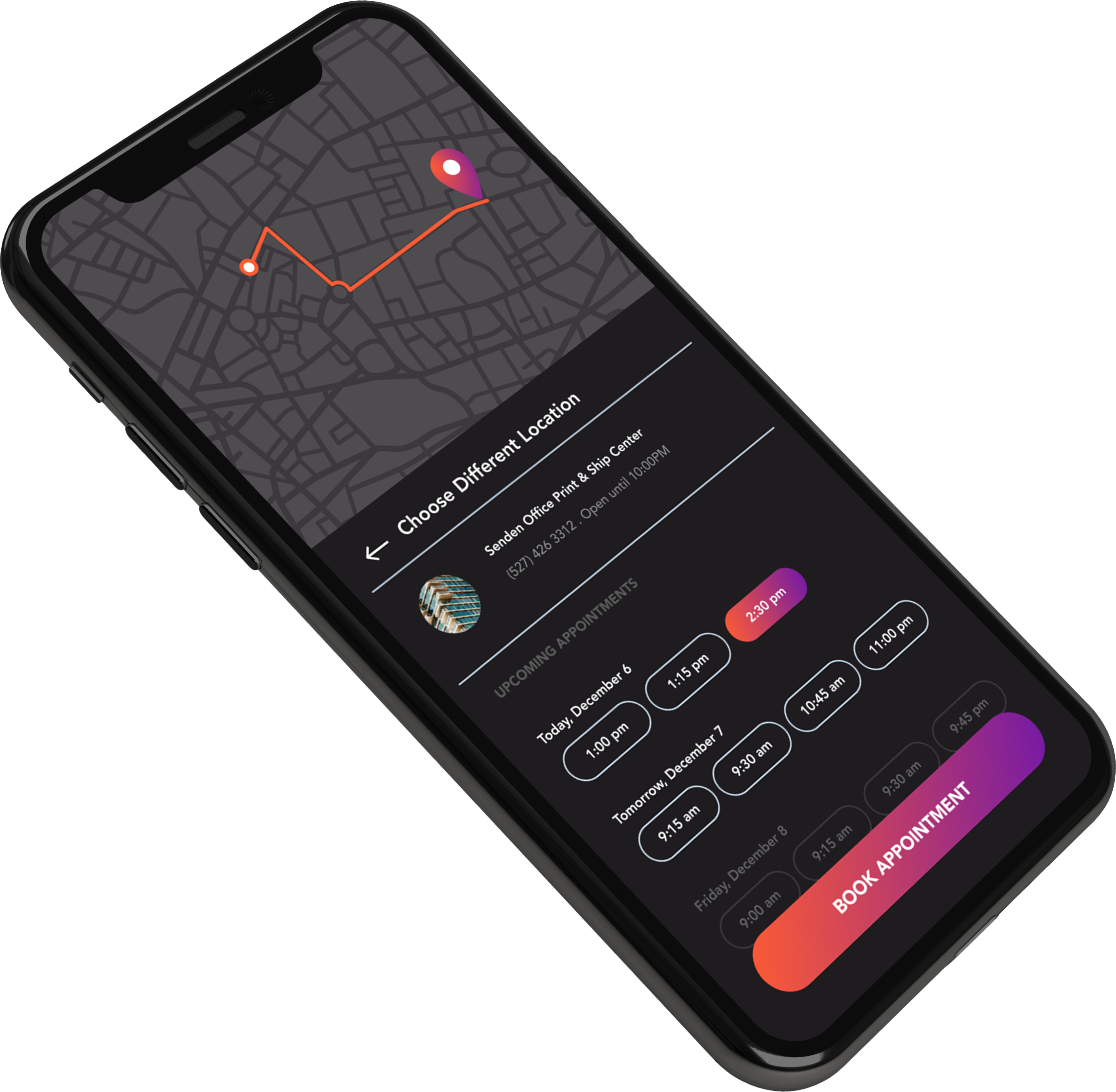
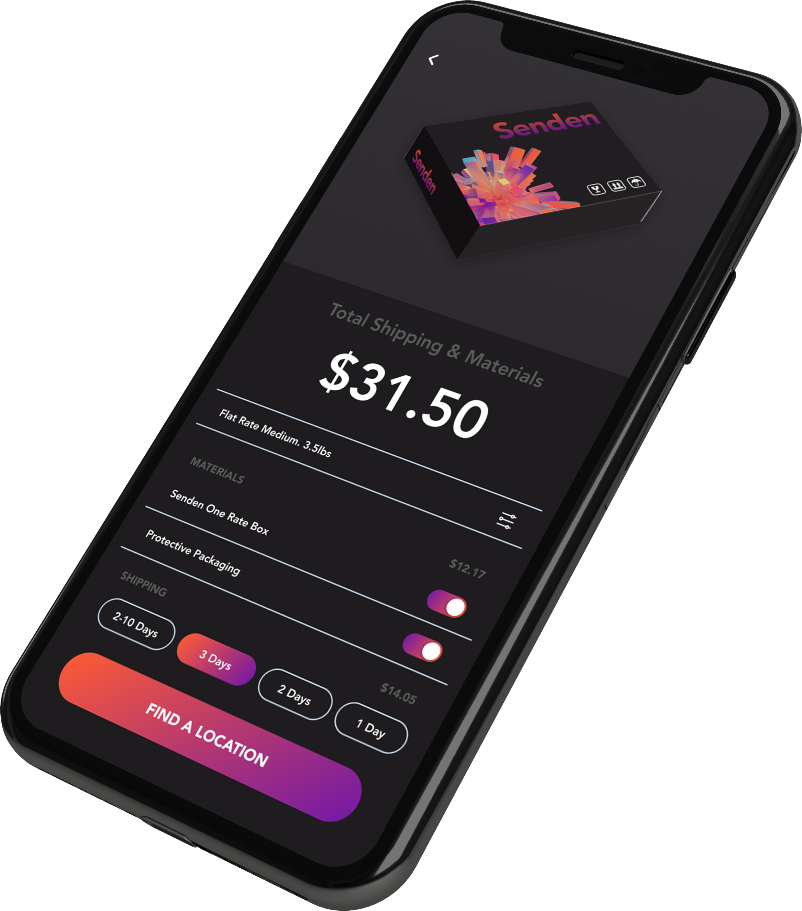
The send experience was the part where we needed to excel.

We figured out that many users don't know where they can deliver their parcels, so having a screen where we show the different delivery spots is very helpful for the end users.

Design

Having a consistent design between the app and the package improves brand recognition for the company.

Parcel Tracking

We wanted to show the most relevant information for the delivery process.

Calendar

After some user testing, we understand that the user is more focused on the parcel arrival date versus how many packages they ordered, that’s why we decide to use a calendar as the main screen.

Send

The send experience was the part where we need to excel.

We figure out that many users don't know where they can deliver their parcels, so having a screen where we show the different delivery spots is very helpful for the end-users.

Design

Having a consistent design between the app and the package improves brand recognition for the company.

Brand Identity

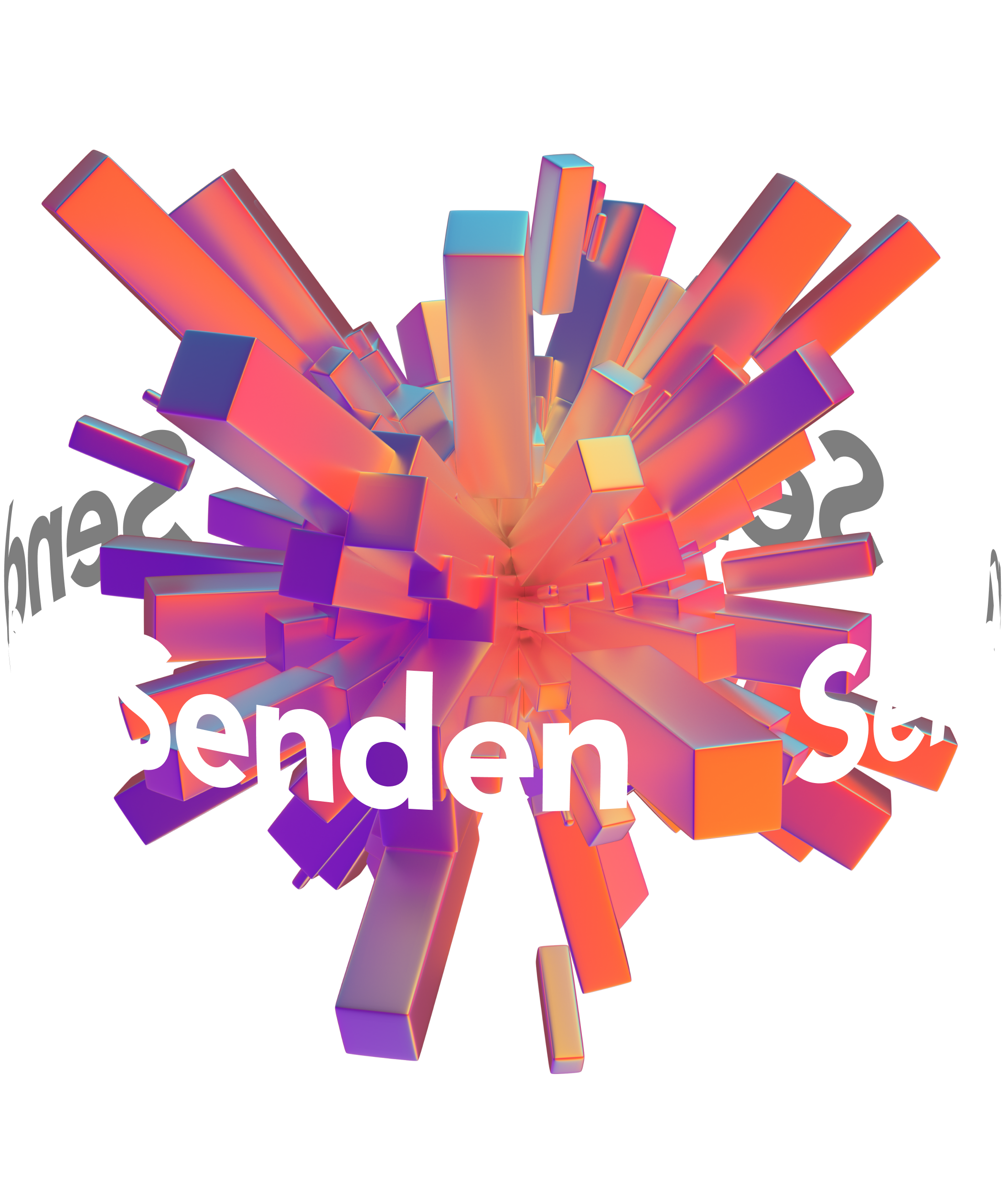
This was one of the avant-garde logos that I made. I wanted to symbolize the world with an explosion of packages. At the same time, I wanted to represent organized chaos. The logo was made in Cinema 4D.

Discover More Projects