

Product Design & Identity

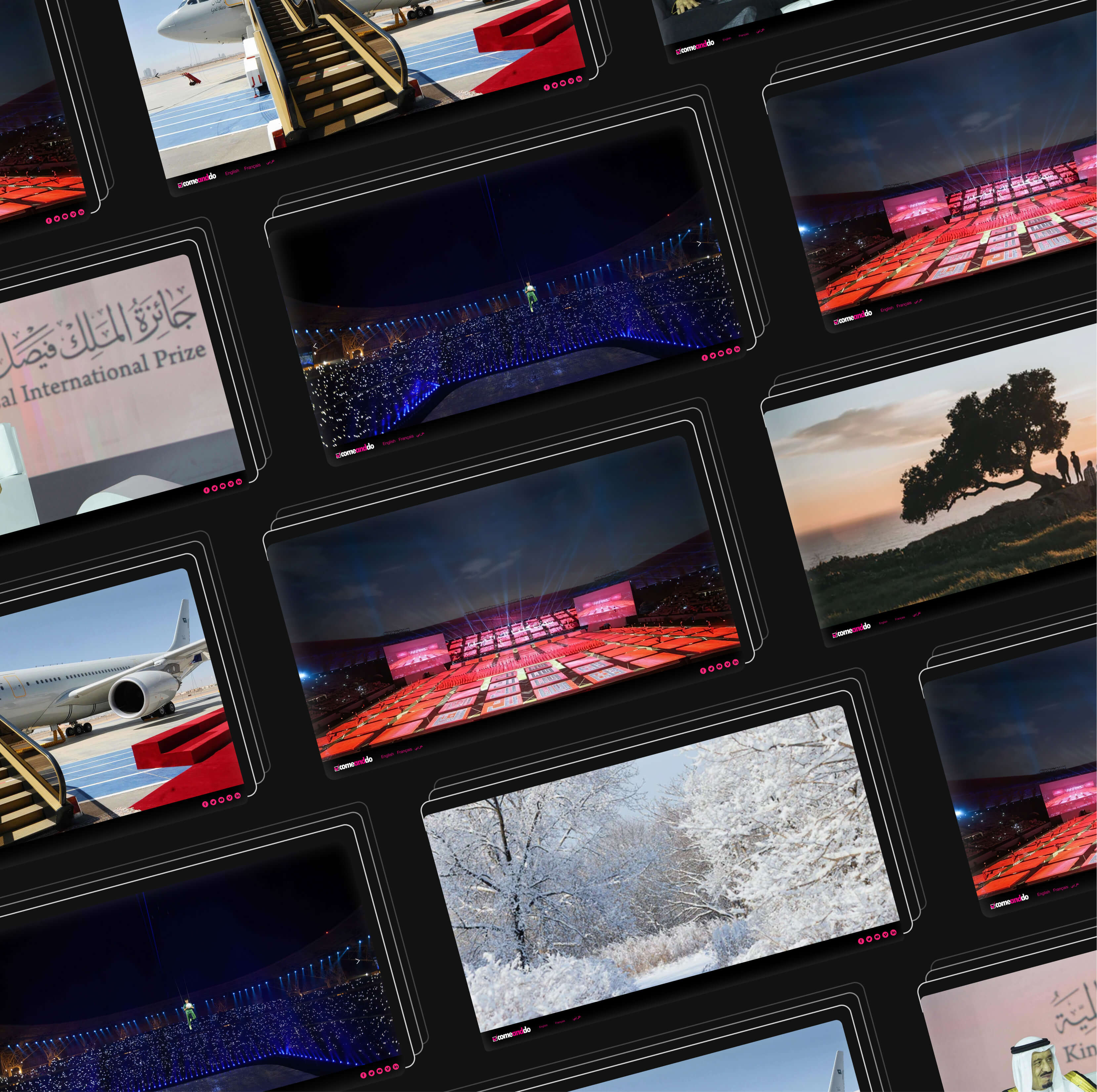
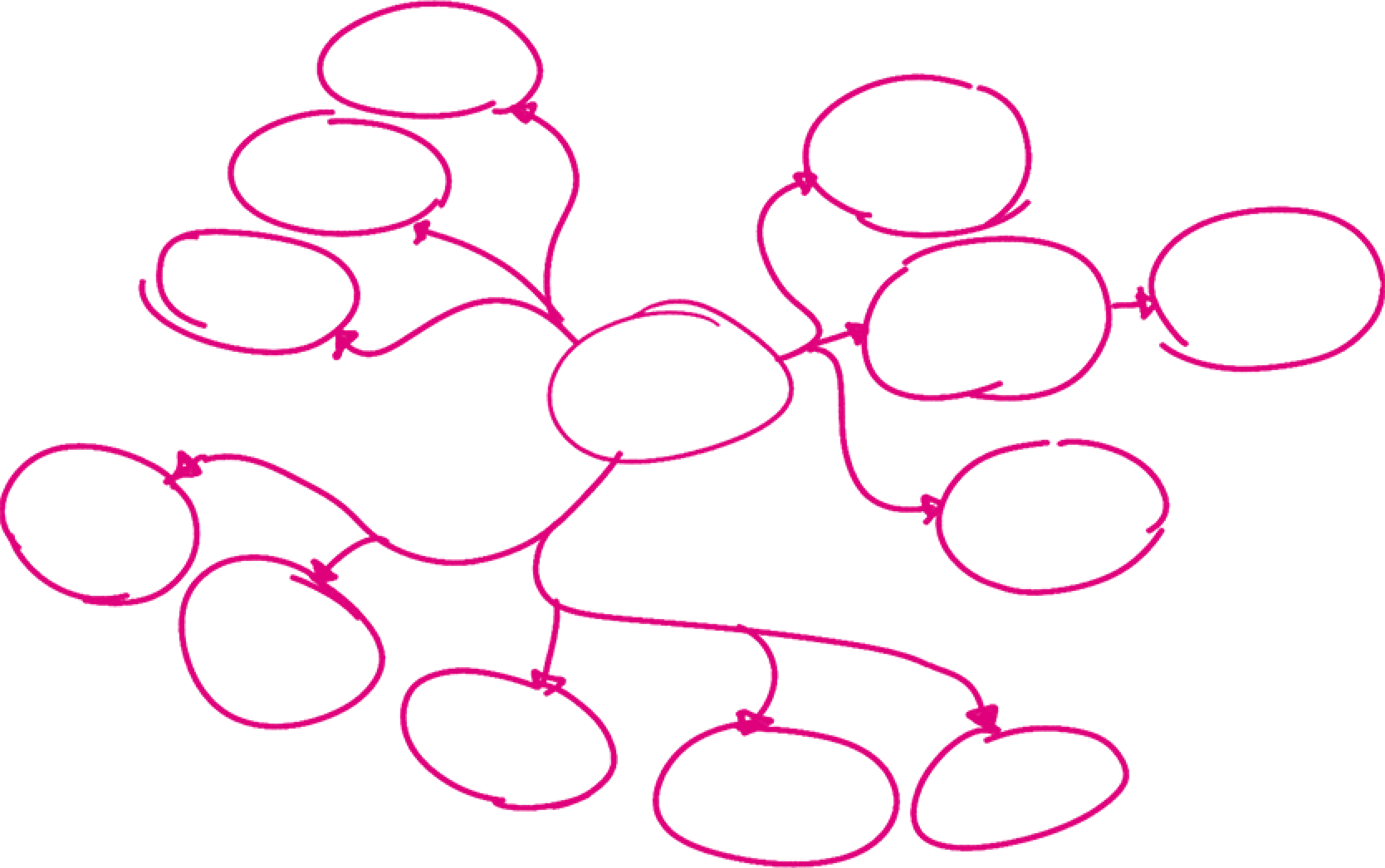
The challenge in this project was to have a firm grasp of the significance of good navigation, simplicity, and clarity. Highlighting the pictures of the different events and having the website in three different languages, English, French, and Arabic, was also very important to the client.

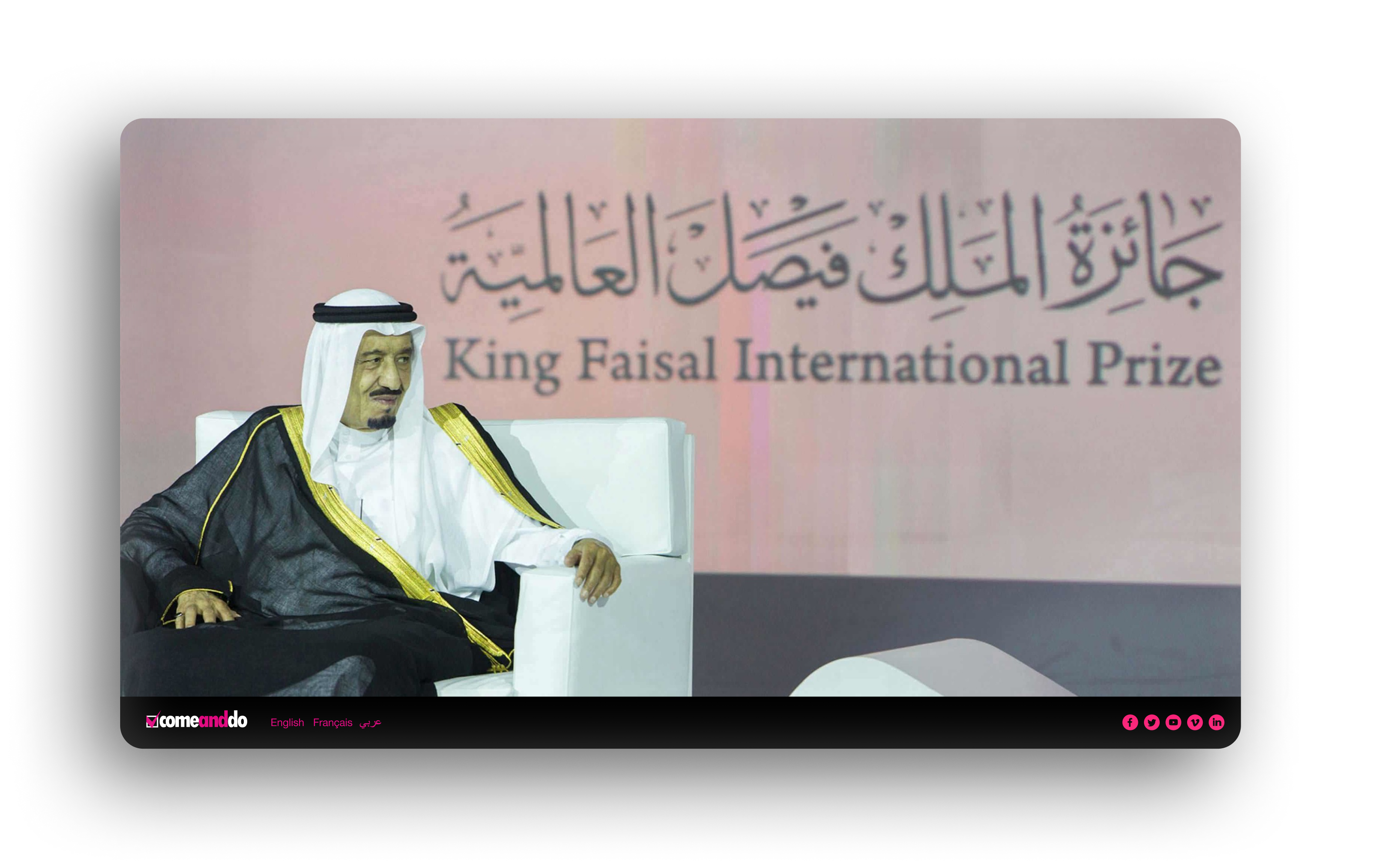
We used the home page to connect the event photos, language options, and social media. That took some time because I wanted to simplify all the information and filter the user's language choice right from the beginning.
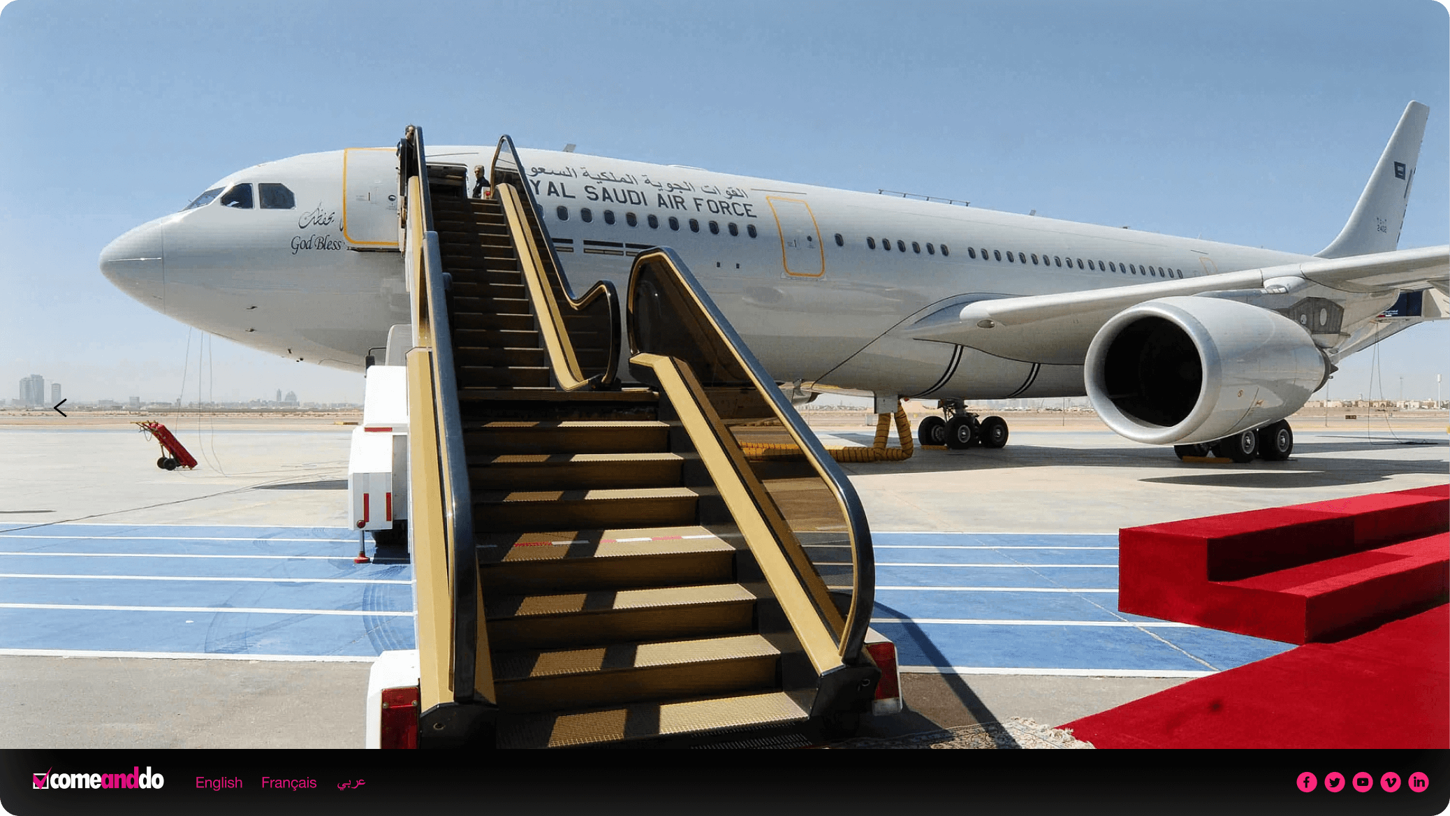
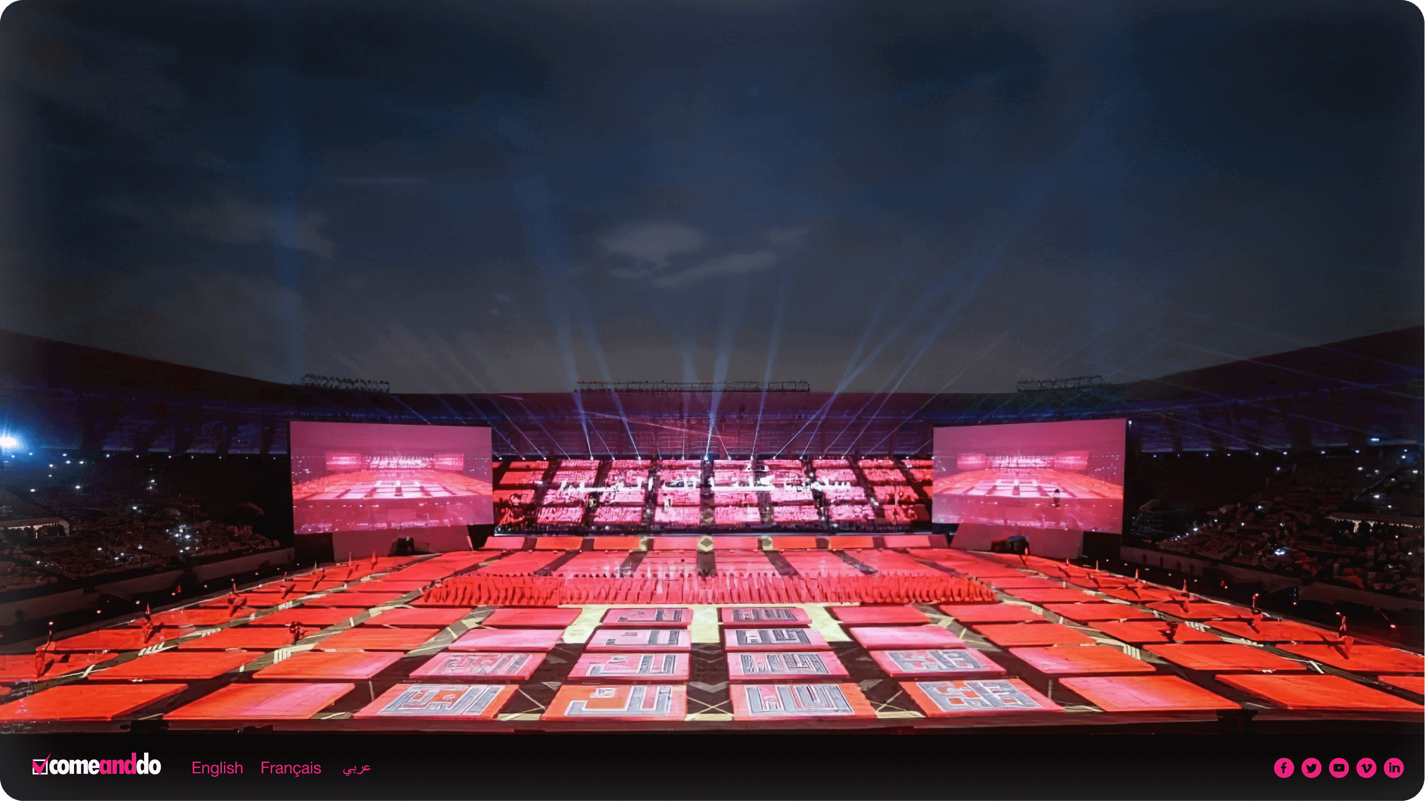
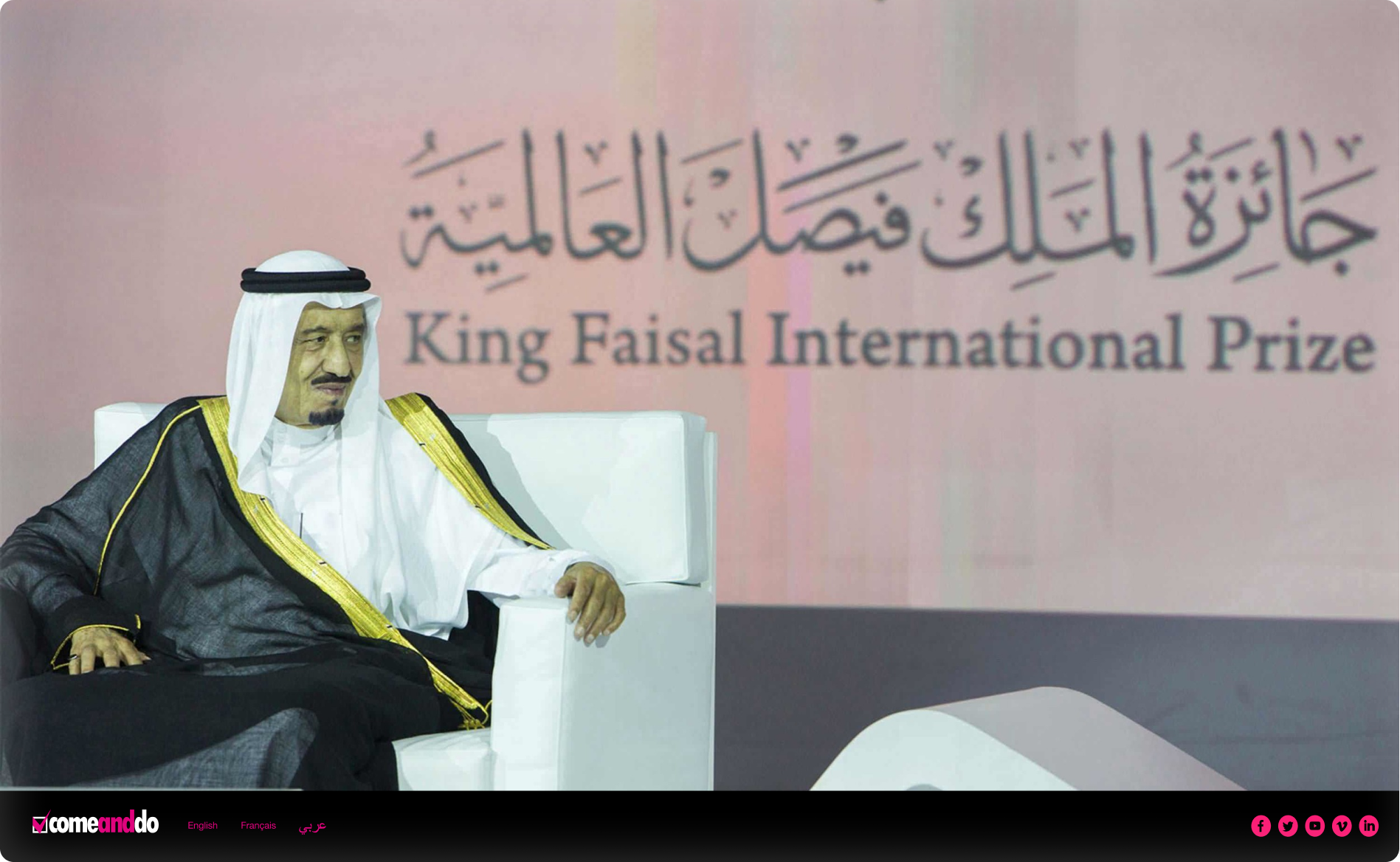
The problem in this project was to show the event pictures with their descriptions next to them. The solution was to show the full photo with an “i” information icon in the top right corner. Once the user clicks on it, the description shows next to the picture.
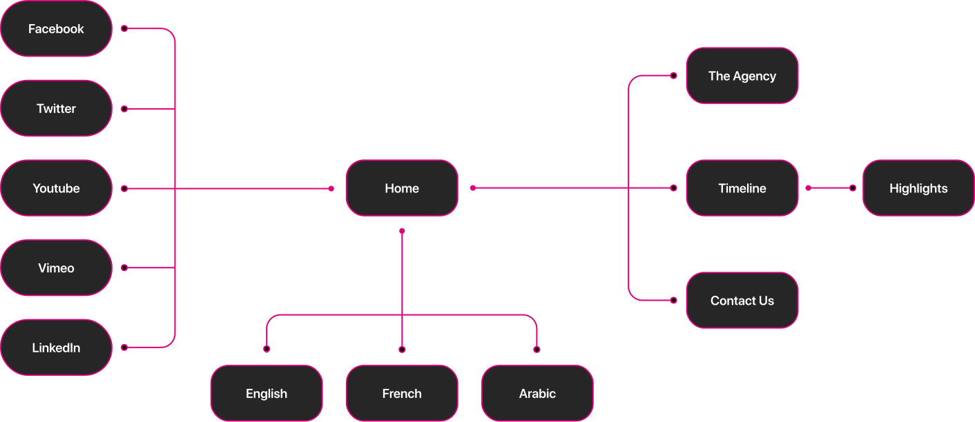
There were different iterations for the project. To make the wireframing process easier, I used an app that helped me scan my drawings and create some prototypes.
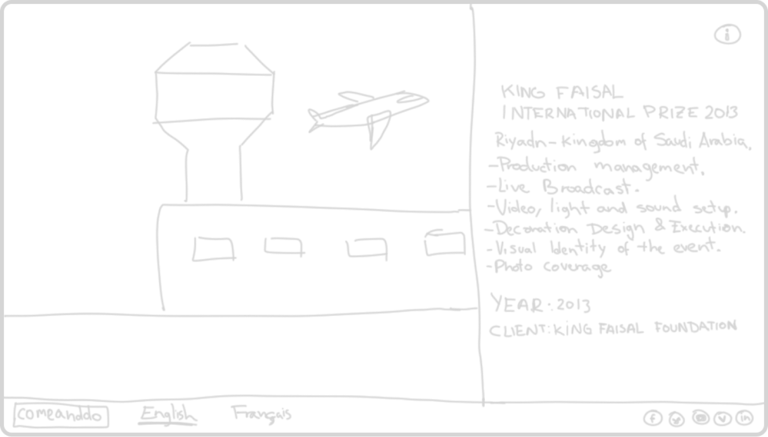
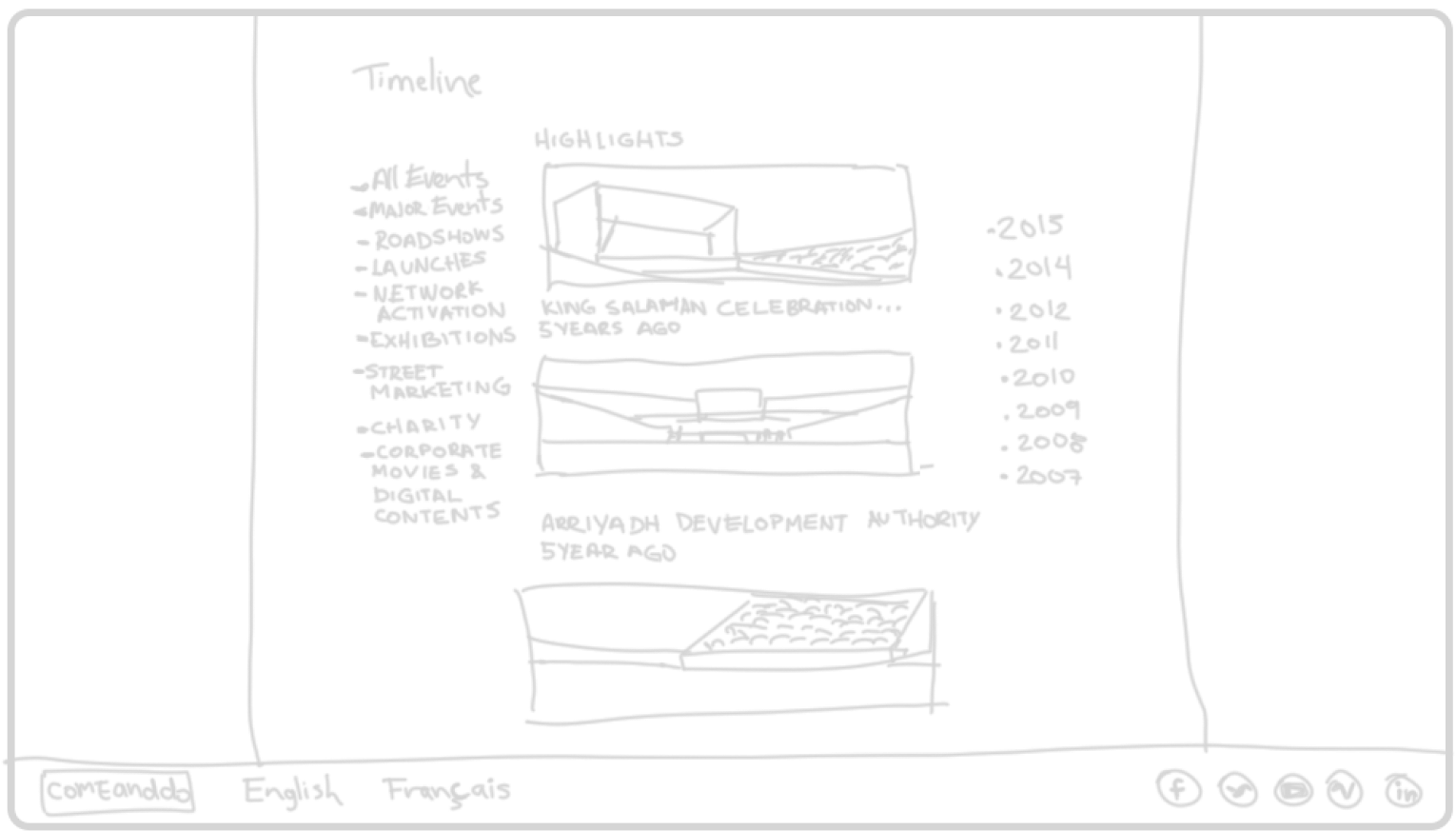
Having a big picture showing the different events that the company was responsible for as a landing page was a good idea since the clients could browse all the different events Comeanddo can organize.
Ensuring that the desktop design also looked good on mobile was challenging because I had to curate the pictures in a specific way so they looked good and stayed centered.
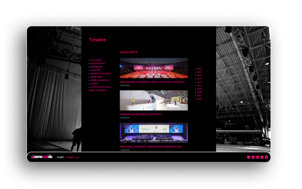
Then I created a timeline to show all the events that the company was involved in. For the Arabic version of the timeline, we had to move the year column from the left to the right because that is the layout Arabic users are used to.