Notuz

Used Apps

Figma

Role

Product Designer

Description

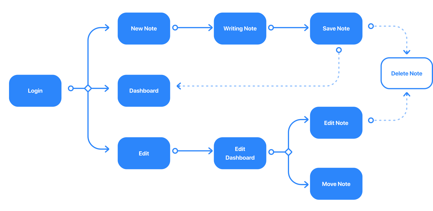
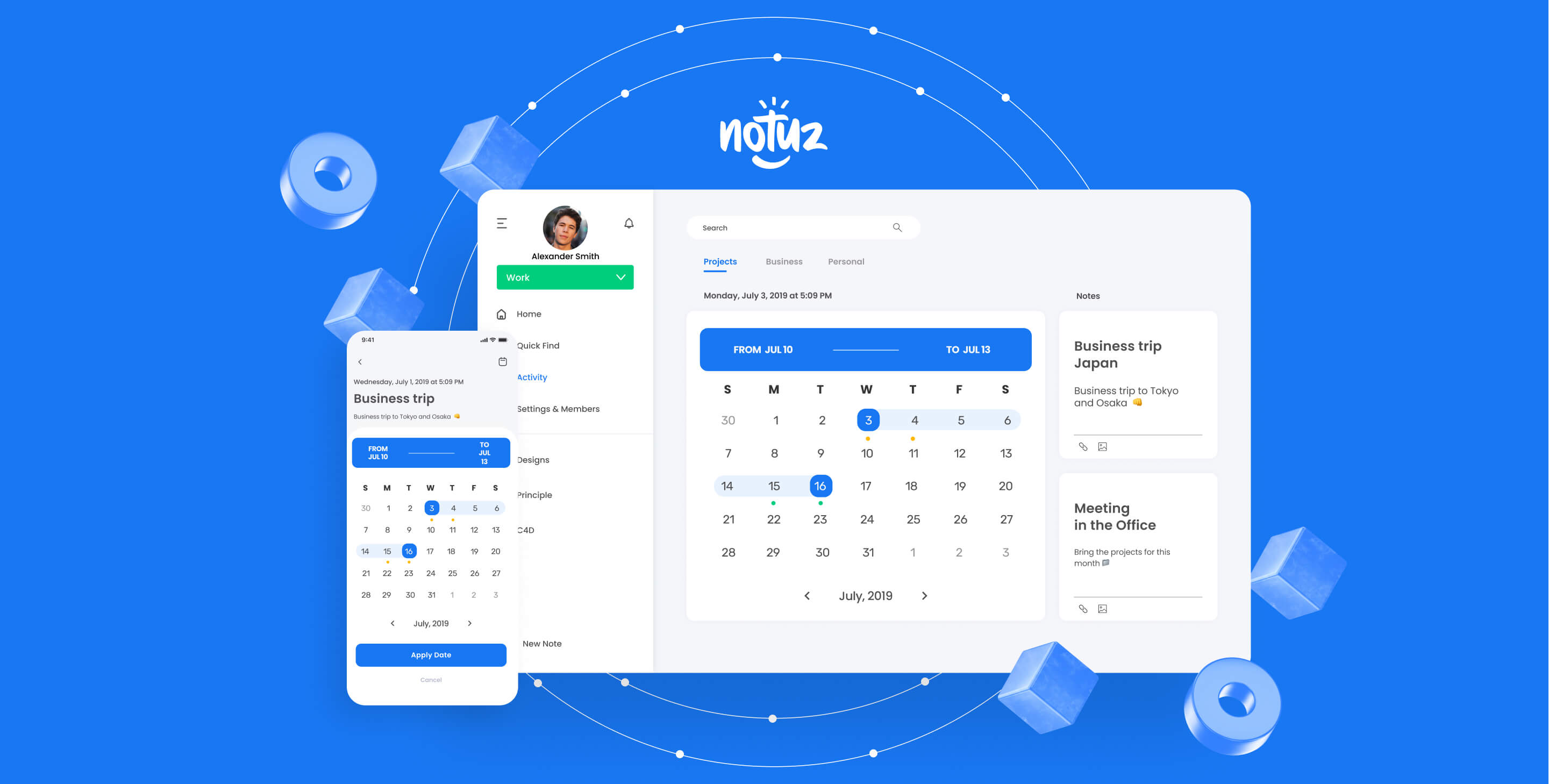
Most of the current note-taking apps are complicated and don't offer cross-platform support. We wanted to create a cross-platform note-taking app, simple and powerful.

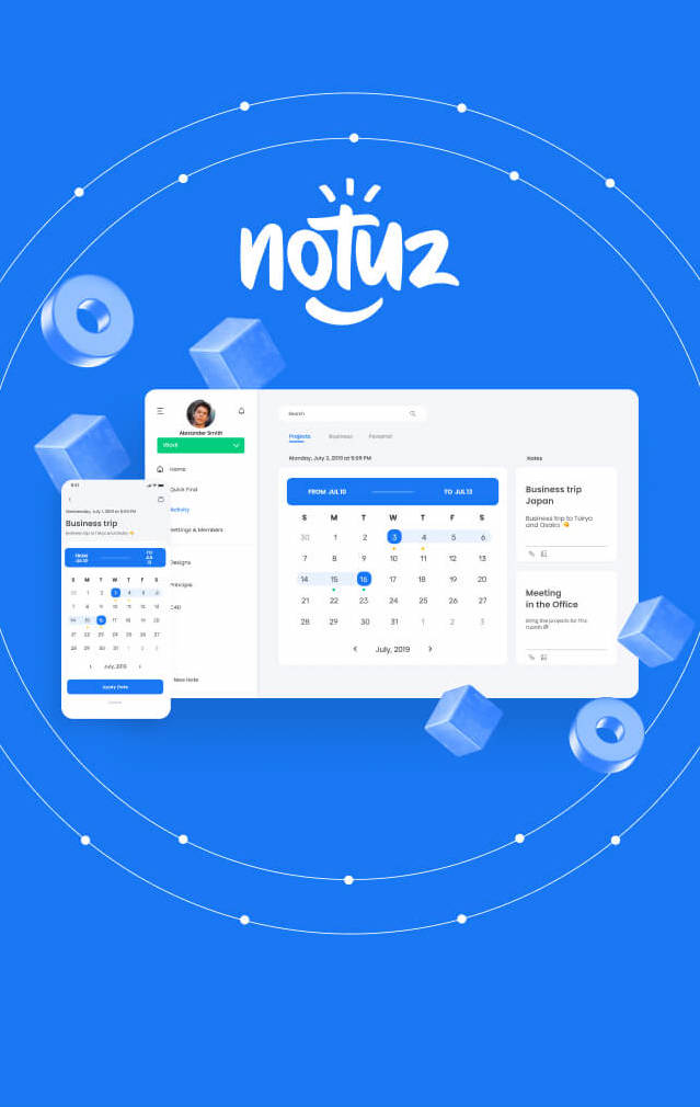
Notuz is a note-taking app for iOS, Android, macOS, and Windows. We created this native app from the ground up.

Focus

  • App Design
  • User Experience
  • User Interface
  • Brand Identity

UI/UX Design

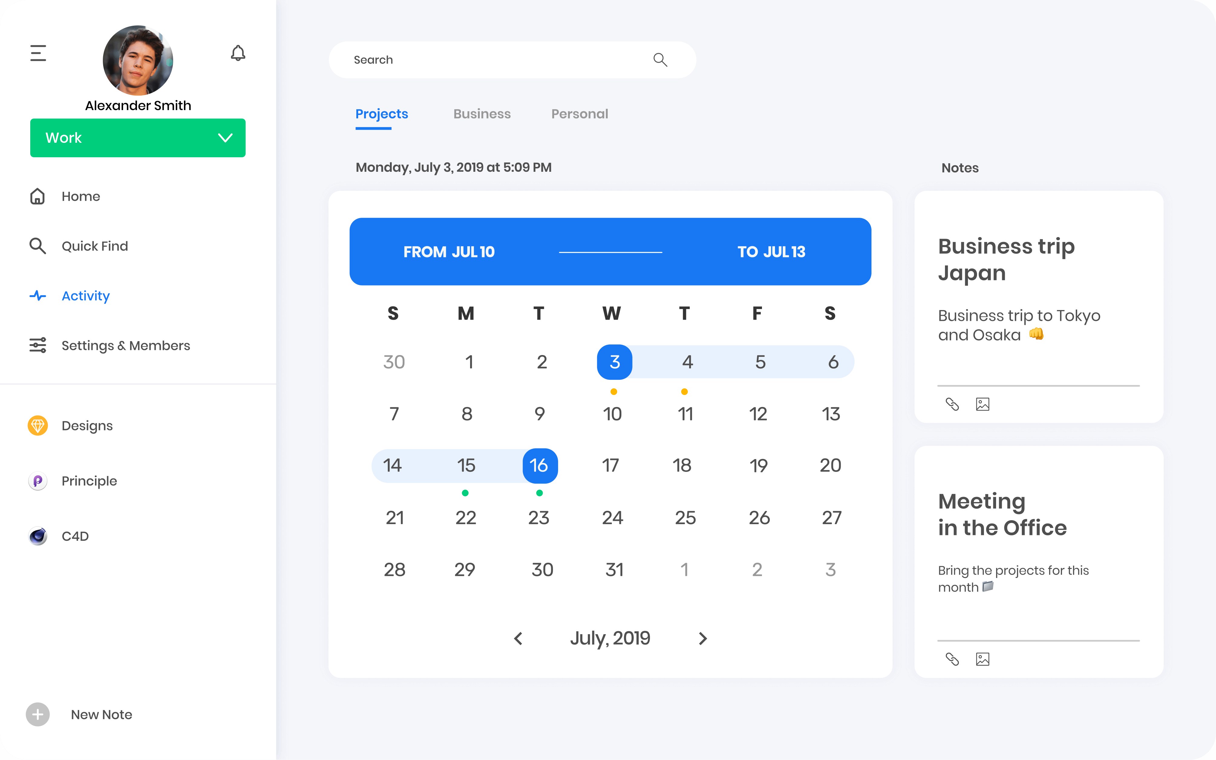
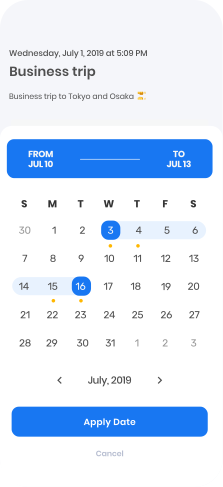
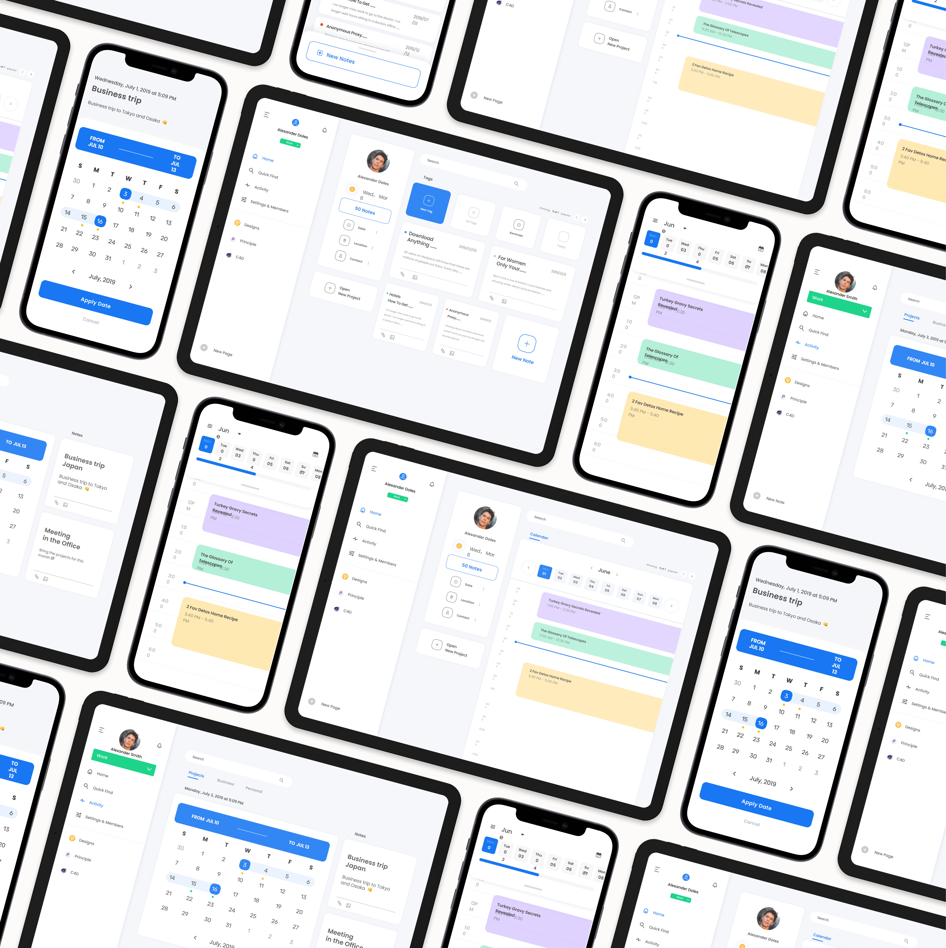
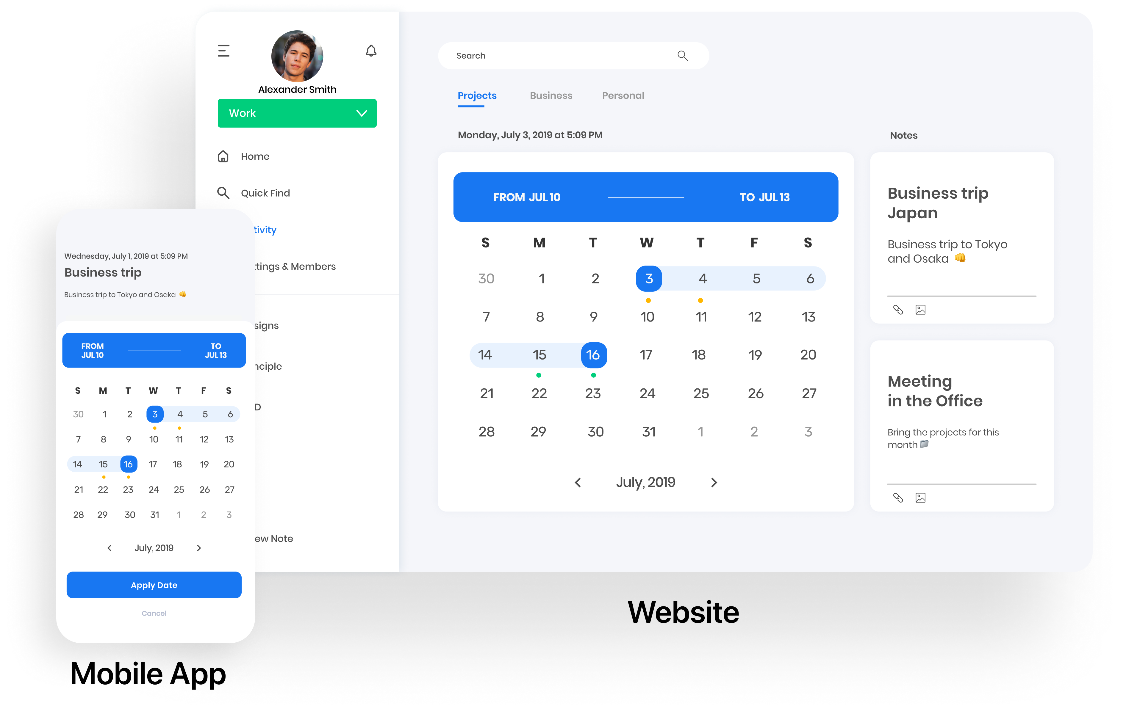
In the interface design, I wanted the important actions to be in color. Also, I added some curved shapes to the UI to add subtle decor to different screens. The UX is focused on young and busy personas, who want the app to be efficient and modern, not as old-fashioned as many of the competitors.
Illustrations

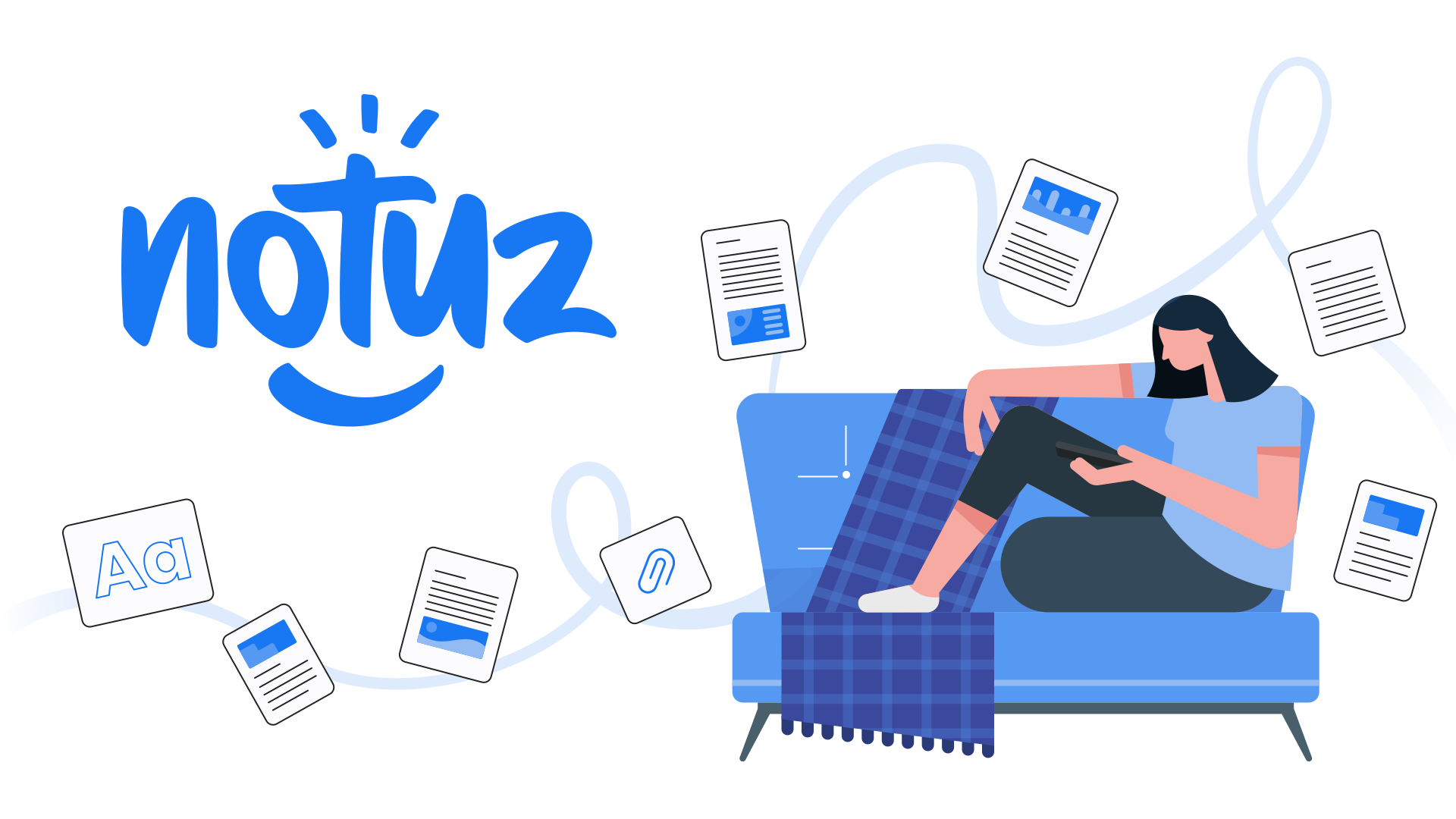
It is important to give a personality to the brand and set the app's tone and voice. With the Notuz illustrations, I wanted to reflect that it is modern, young, new, and an alternative to the competition.

Typography and color

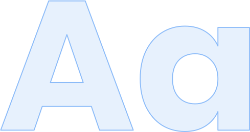
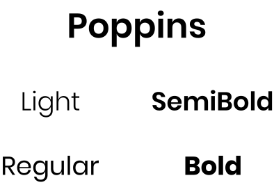
The typography keeps Notuz light and easy to read on every platform.

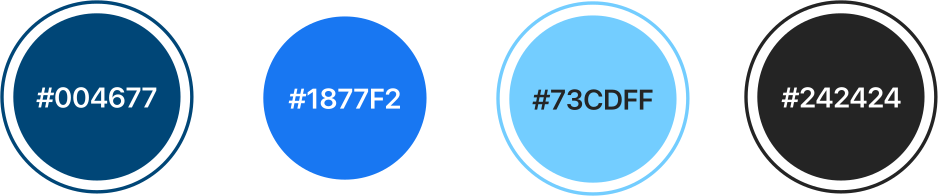
Color is used with intention: the important actions get color, so they stand out from the calm, neutral interface.

Logo and brand design

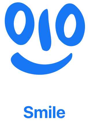
With the Notuz logo and brand design, I wanted to reflect that the app is modern, young, and a fresh alternative to the competition.

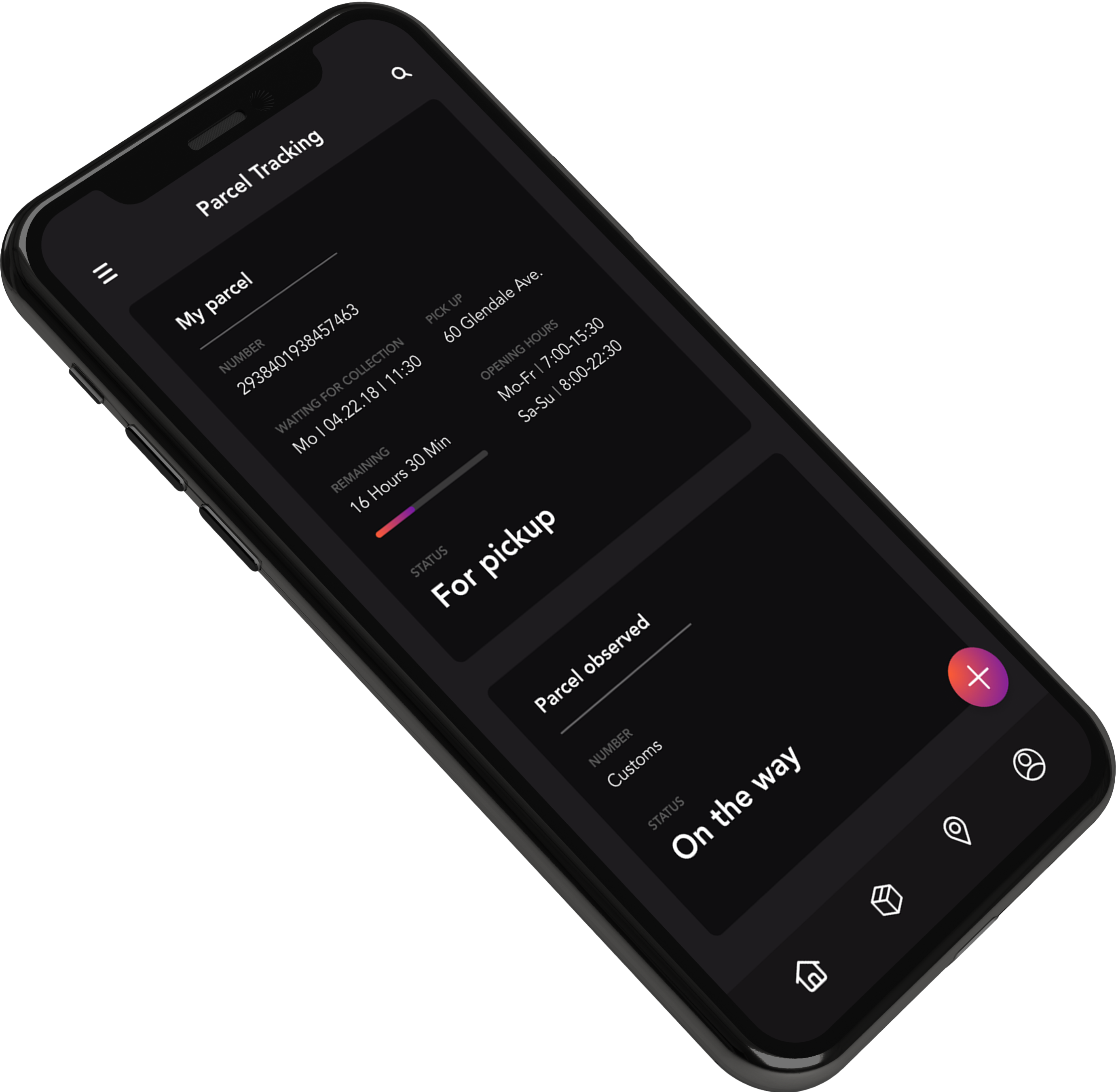
Parcel Tracking

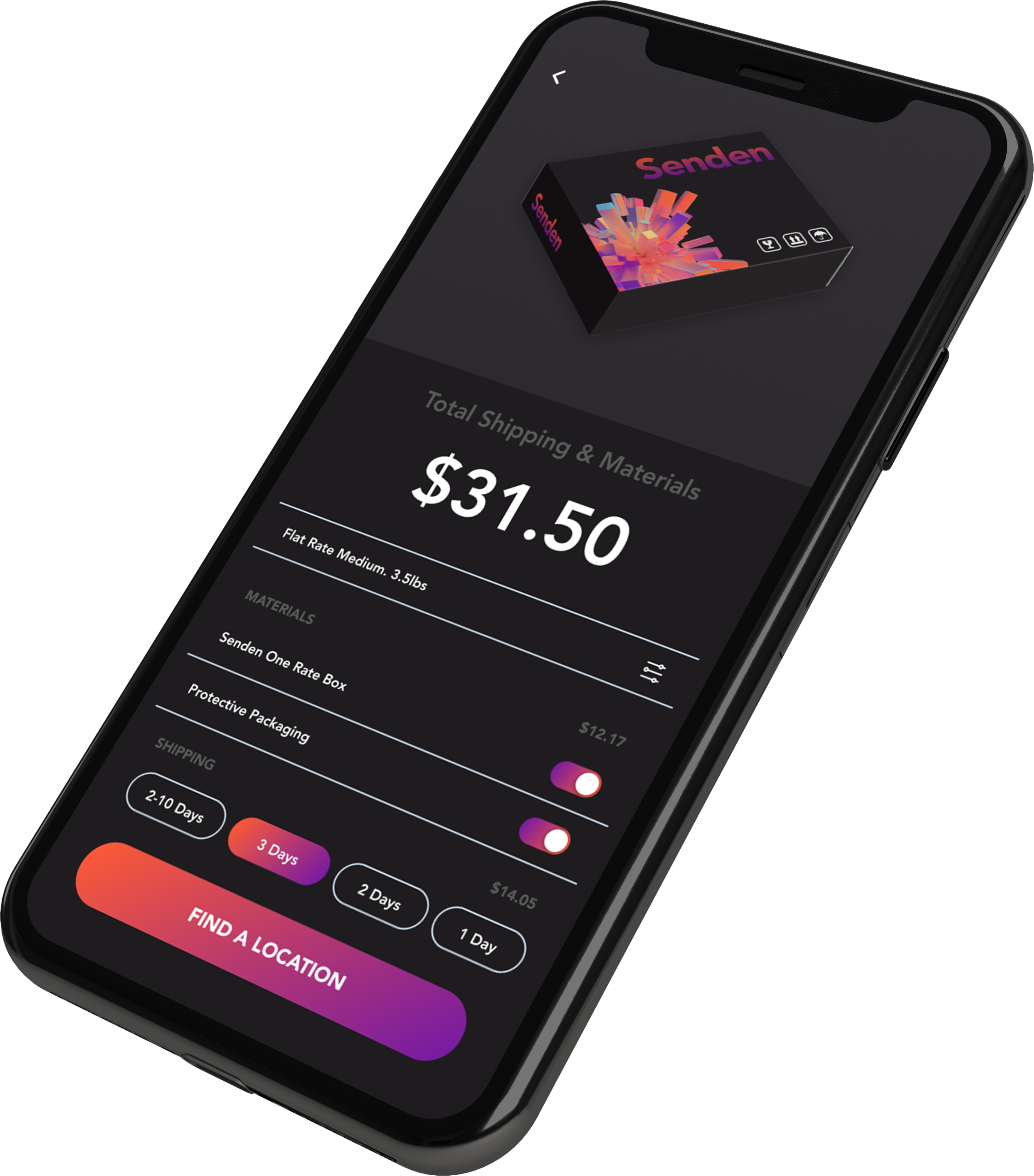
We wanted to show the most relevant information for the delivery process.

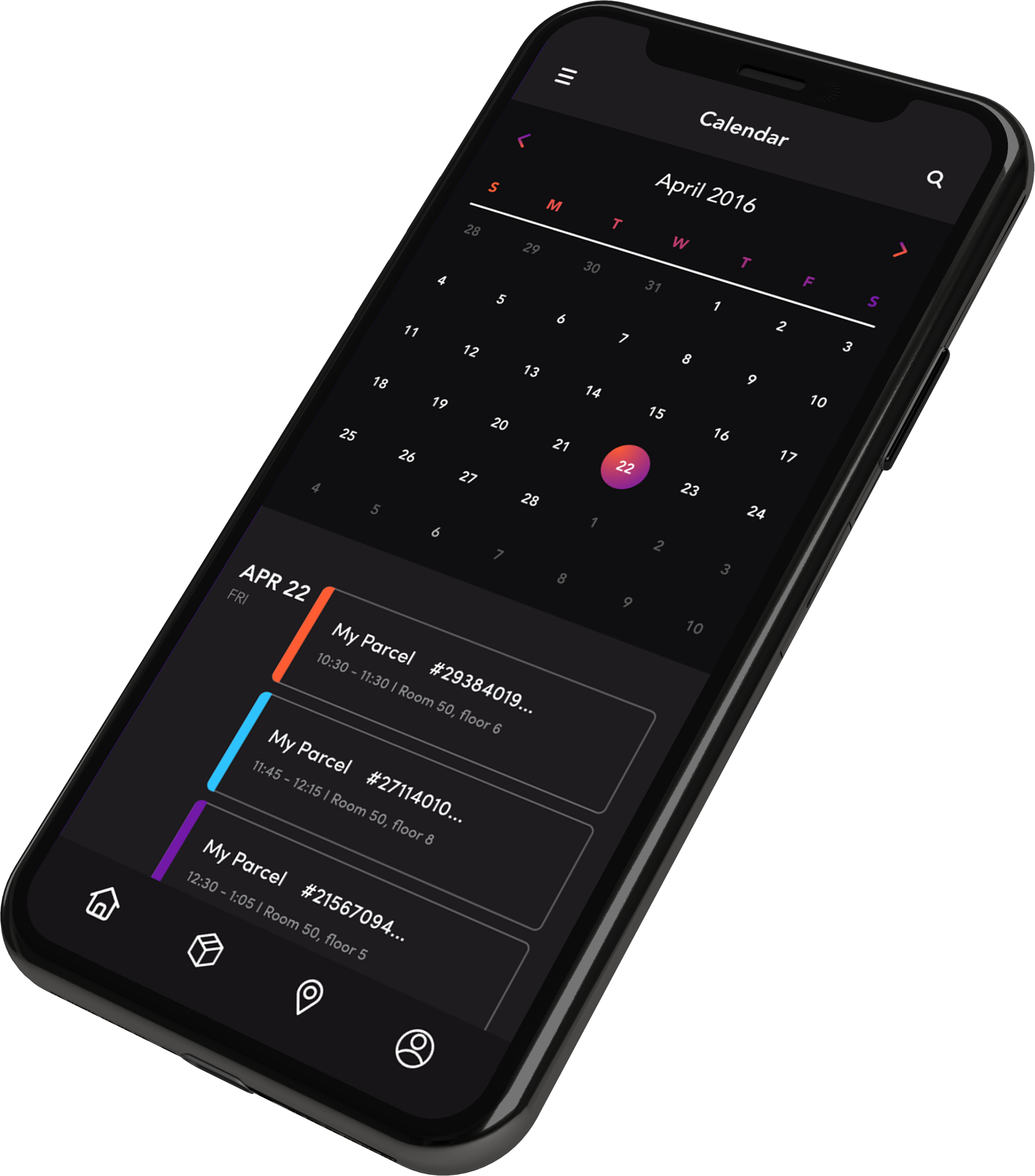
Calendar

After some user testing, we understood that the user is more focused on the parcel arrival date versus how many packages they ordered, which is why we decided to use a calendar as the main screen.

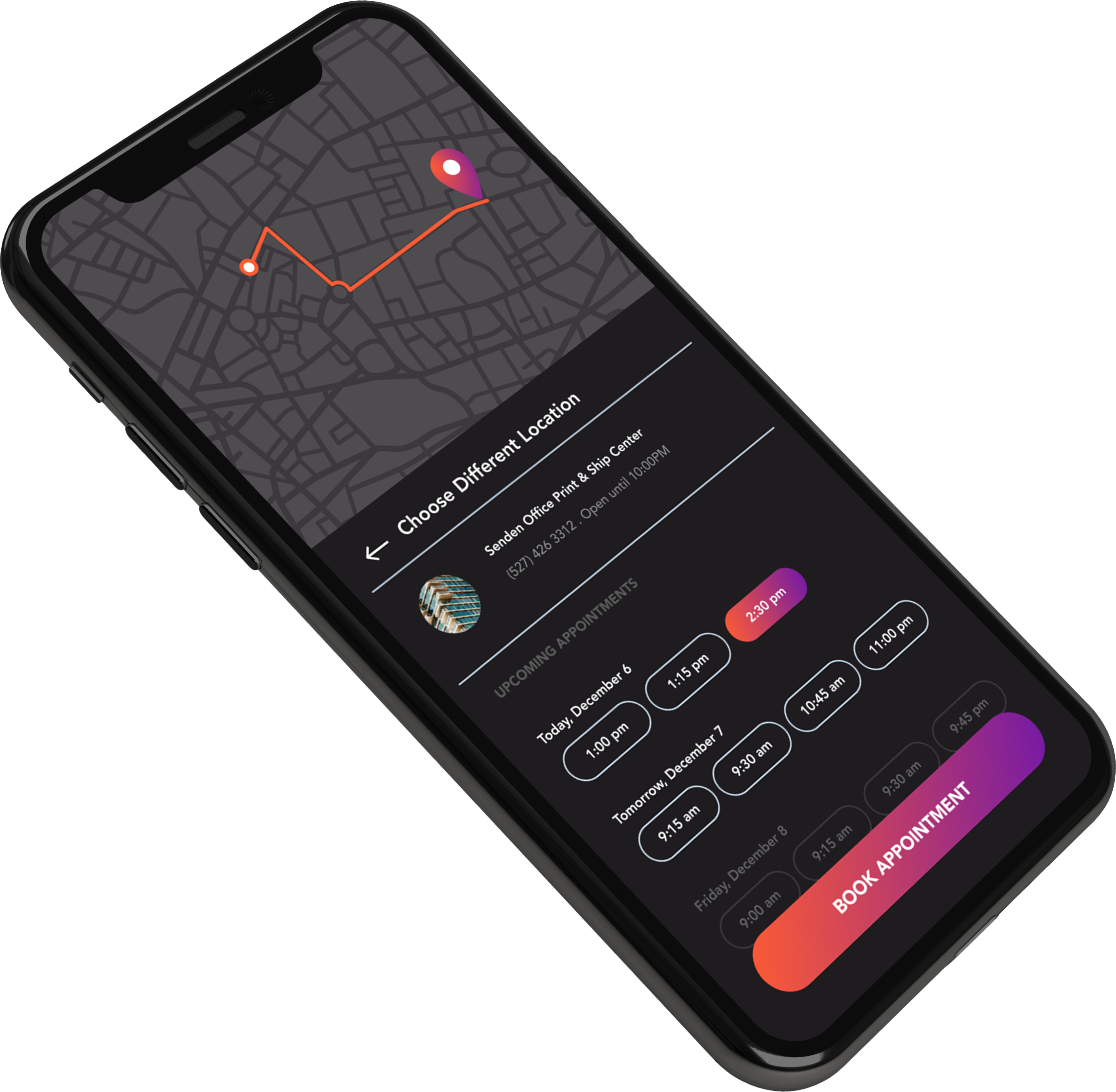
Send

The send experience was the part where we needed to excel.

We figured out that many users don't know where they can deliver their parcels, so having a screen that shows the different delivery spots is very helpful for the end users.

Design

Having a consistent design between the app and the package improves brand recognition for the company.

Parcel Tracking

We wanted to show the most relevant information for the delivery process.

Calendar

After some user testing, we understood that the user is more focused on the parcel arrival date versus how many packages they ordered, which is why we decided to use a calendar as the main screen.

Send

The send experience was the part where we needed to excel.

We figured out that many users don't know where they can deliver their parcels, so having a screen that shows the different delivery spots is very helpful for the end users.

Design

Having a consistent design between the app and the package improves brand recognition for the company.

Brand Identity

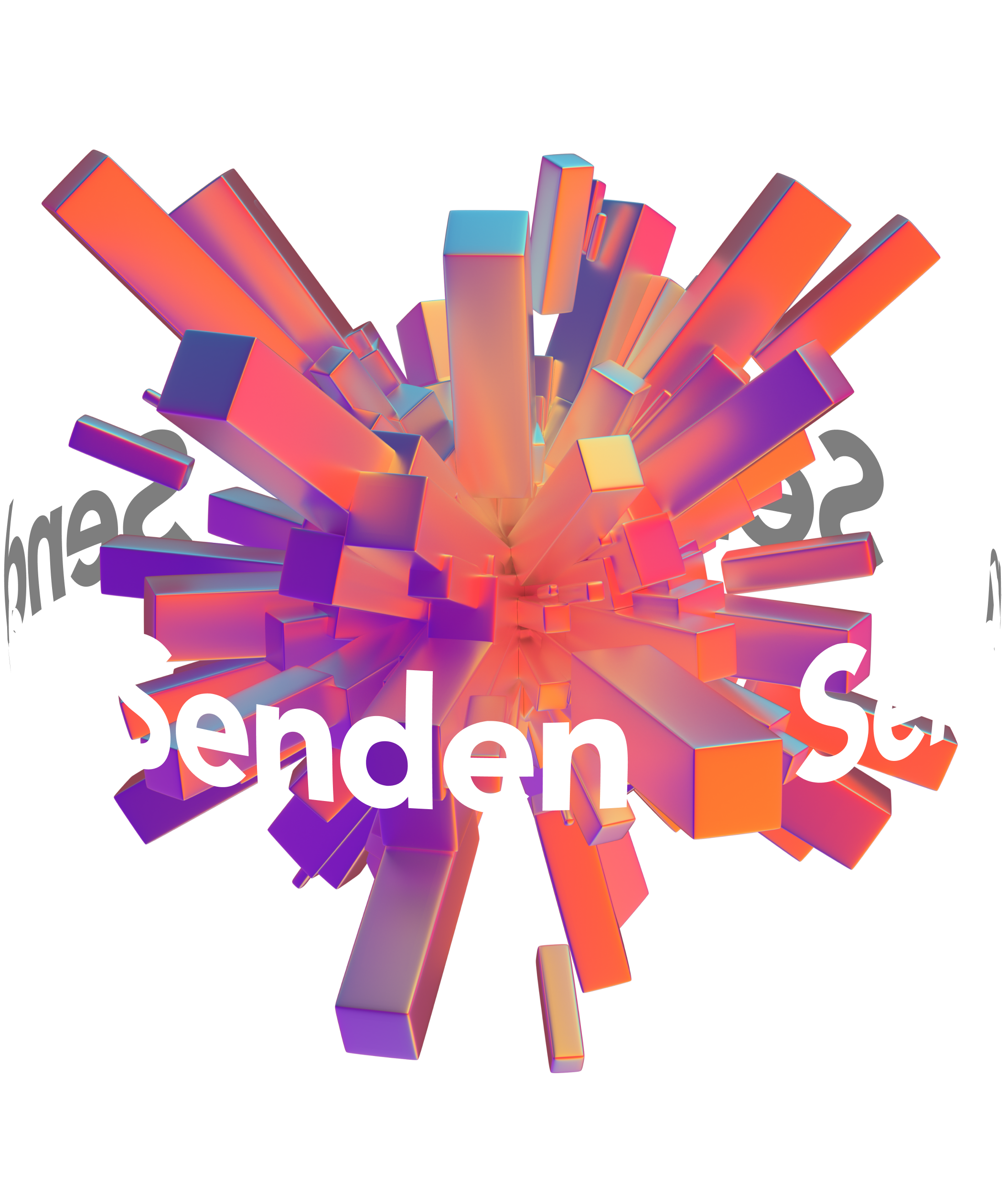
This was one of the avant-garde logos that I made. I wanted to symbolize the world with an explosion of packages. At the same time, I wanted to represent organized chaos. The logo was made in Cinema 4D.

Discover More Projects