Puru

Used Apps

Figma
After Effects
Principle

Role

Product Designer

Description

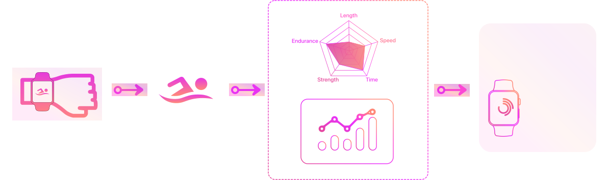
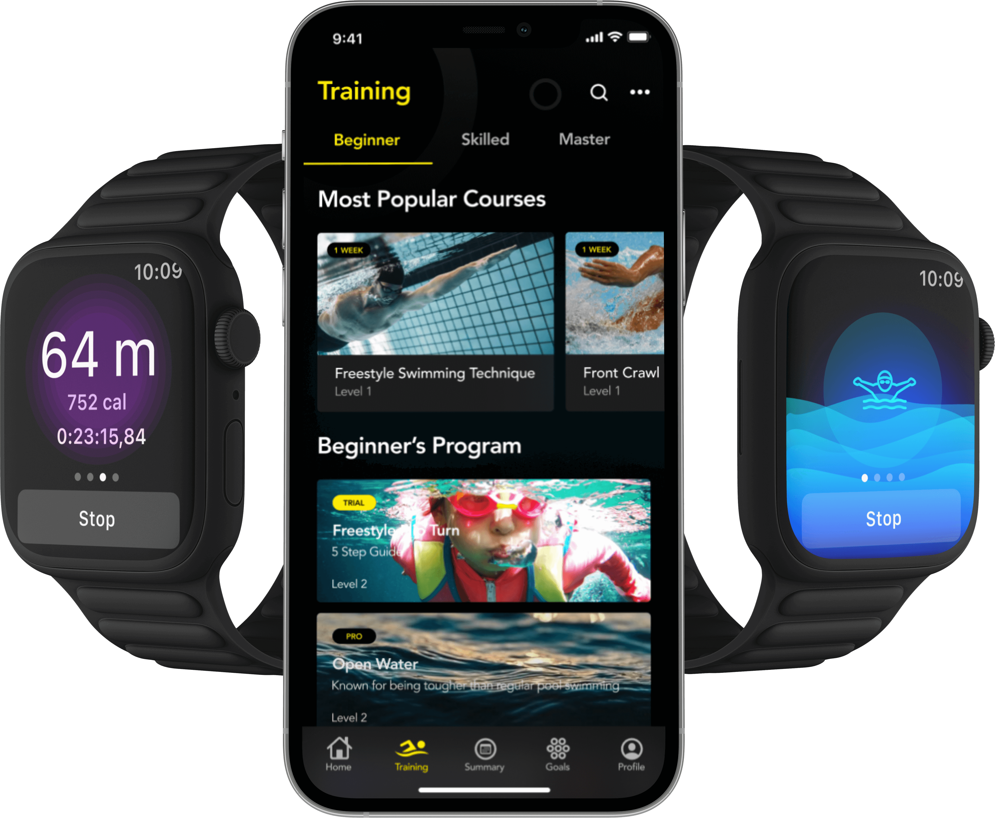
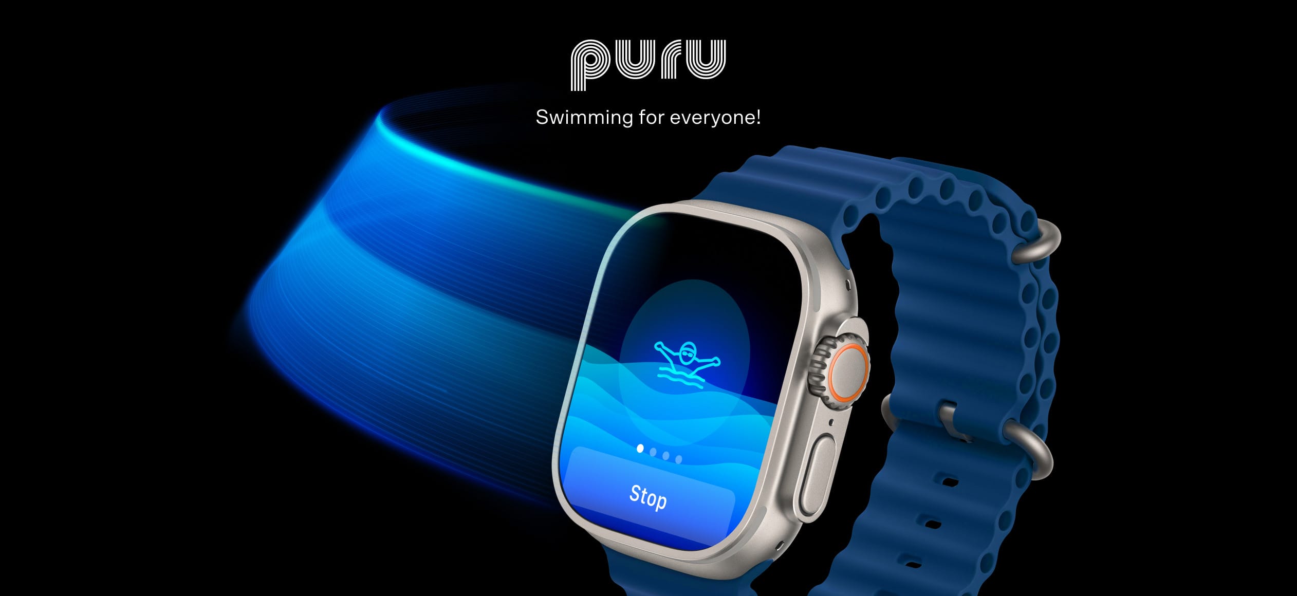
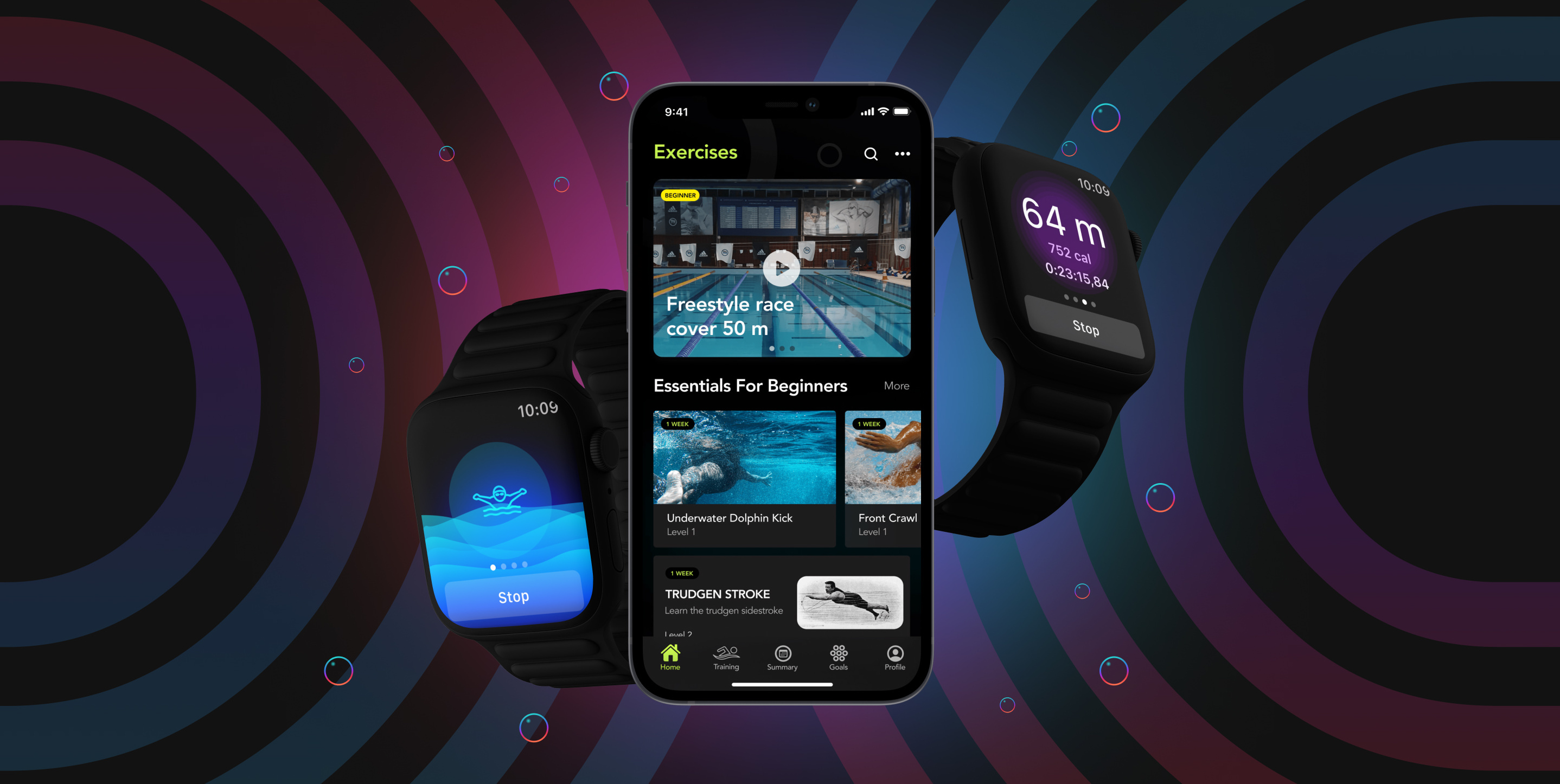
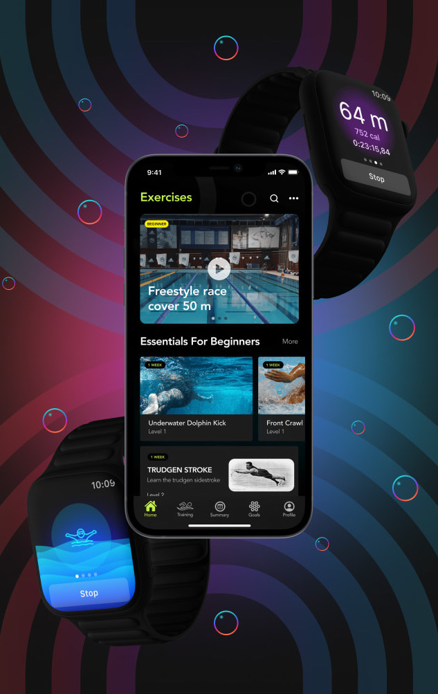
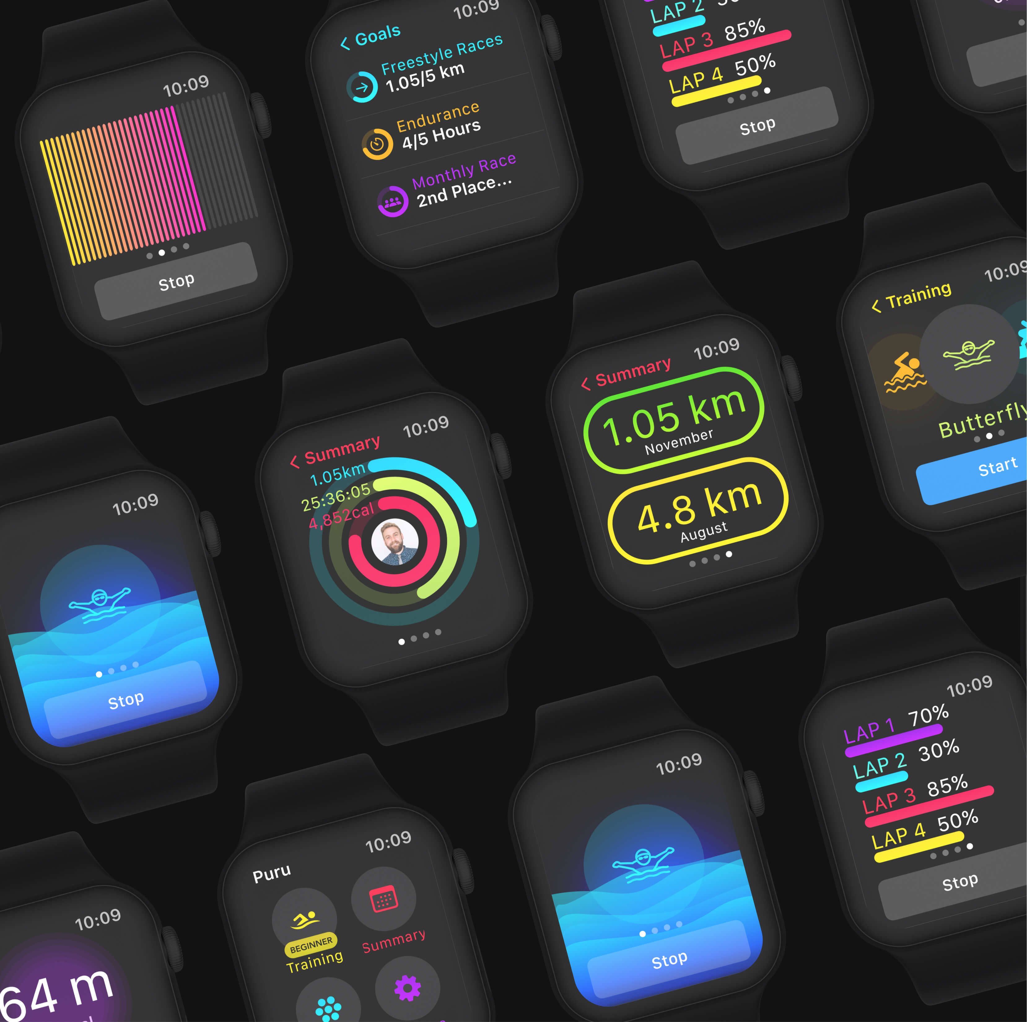
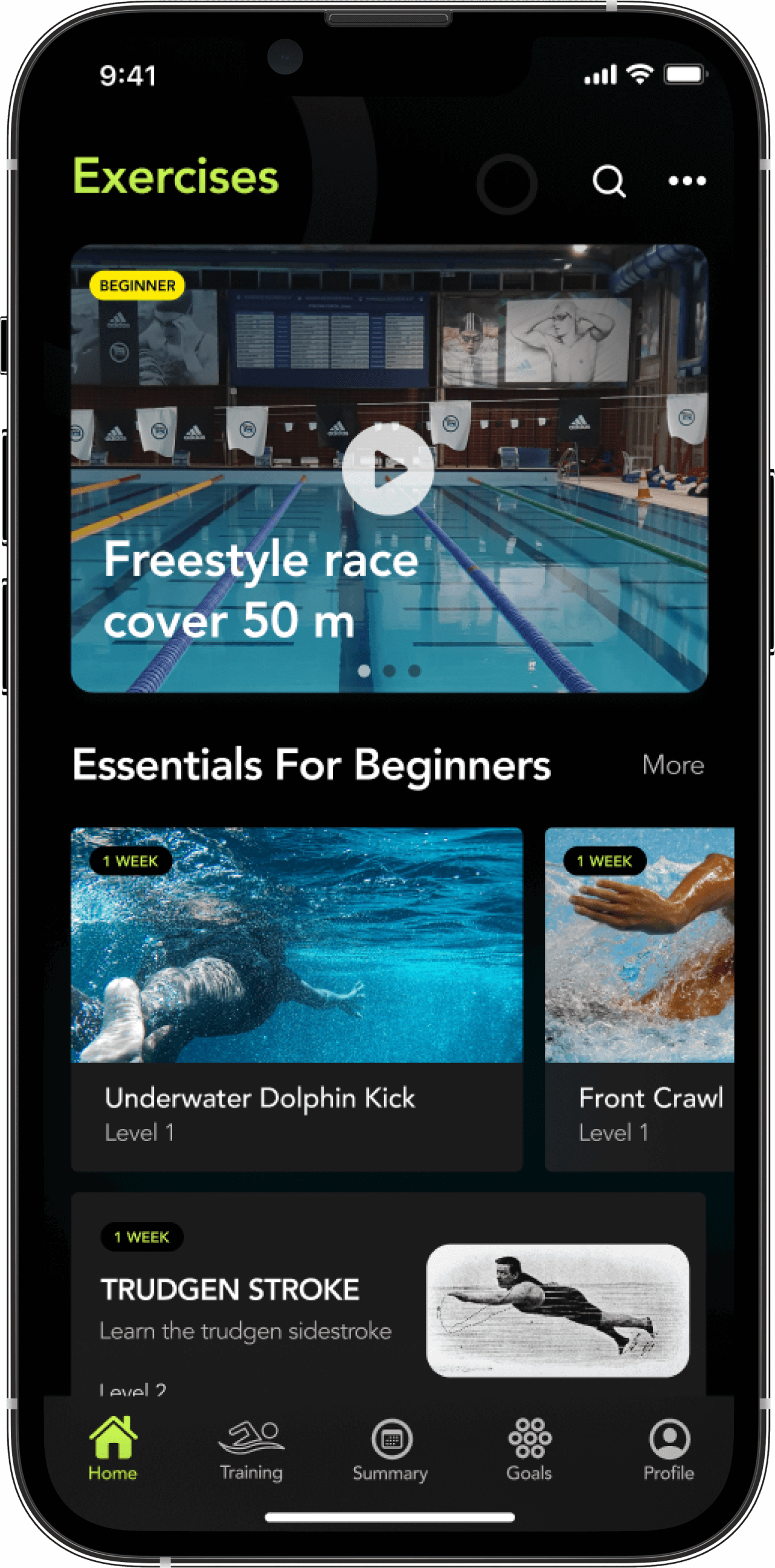
Puru is a new and modern swimming app that can help swimmers of different skill levels improve and learn new abilities. The app is made for wearable devices, since the wearable is the primary tracking tool. The app will work on mobile devices and smartwatches.

Focus

  • App Design
  • UI & UX
  • Brand Identity

Wireframing

The wireframing was made on an iPad using Procreate. It is incredible how easy and fast it is to create quick wireframes and share them with the client. Also, I used a white color outline with a black background to match the branding.
UI/UX

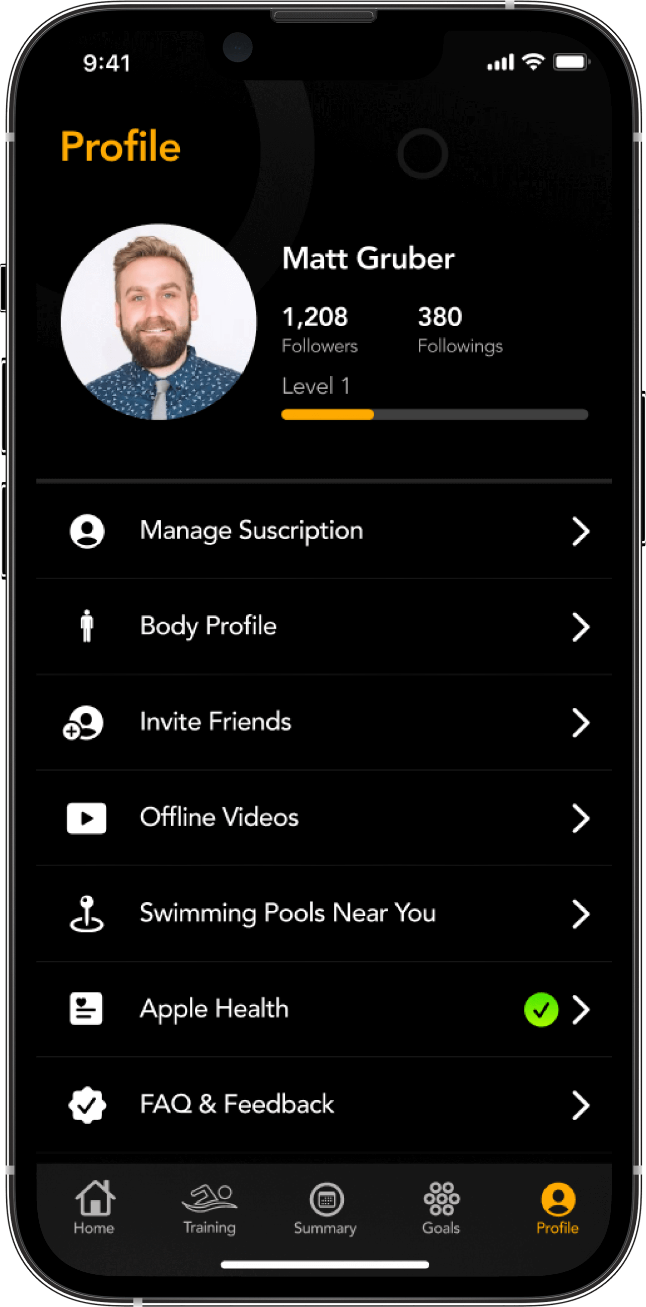
Design a wearable app for swimmers. It should be able to track exercise, provide reports, and give feedback about pace, heart rate, laps, duration, and calories burned during activity. The app should link to a mobile version with more detailed overviews of a swimmer’s data.
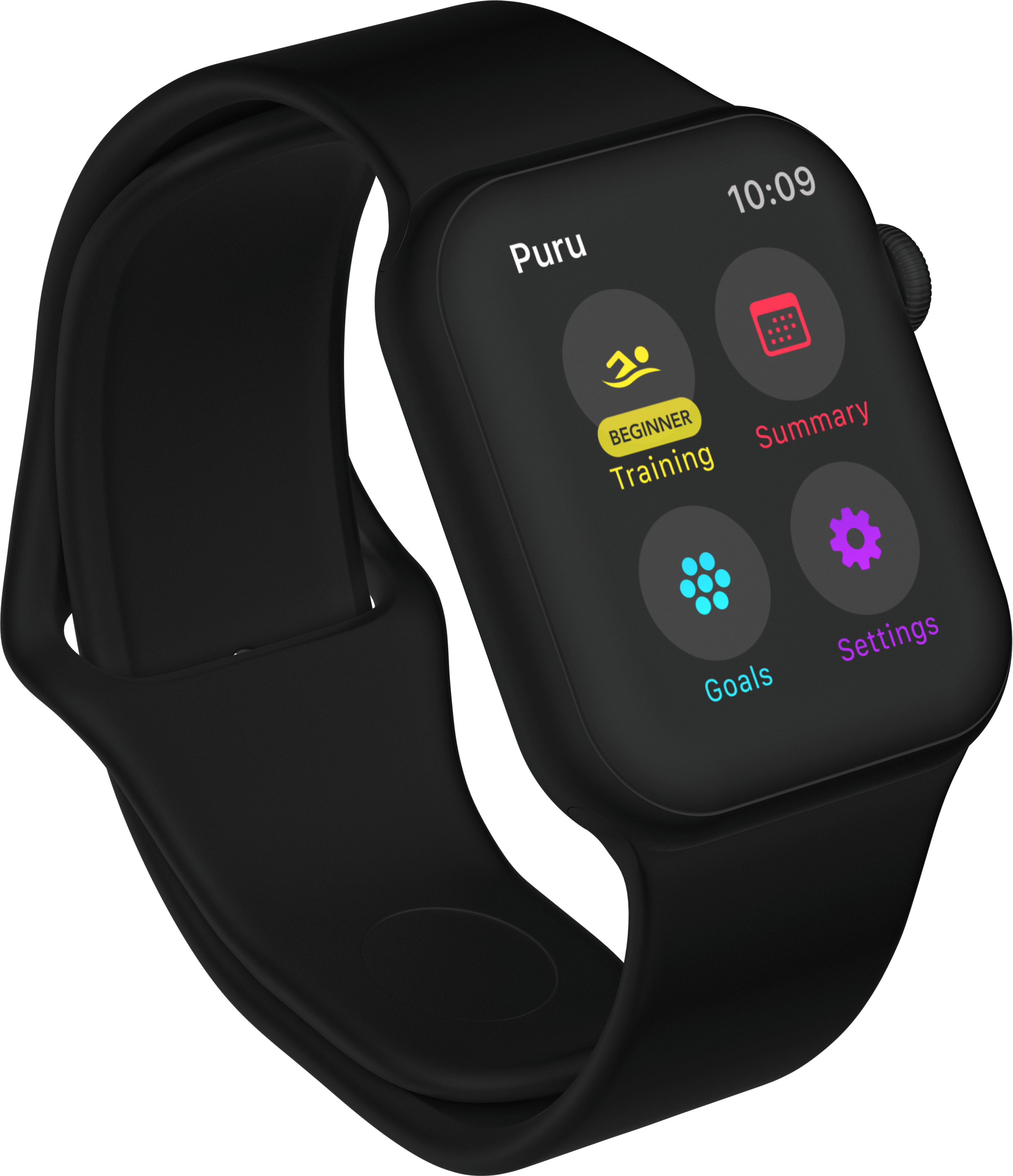
Menu

The Puru experience on smartwatches is focused on being intuitive, so that users can achieve their training goals.

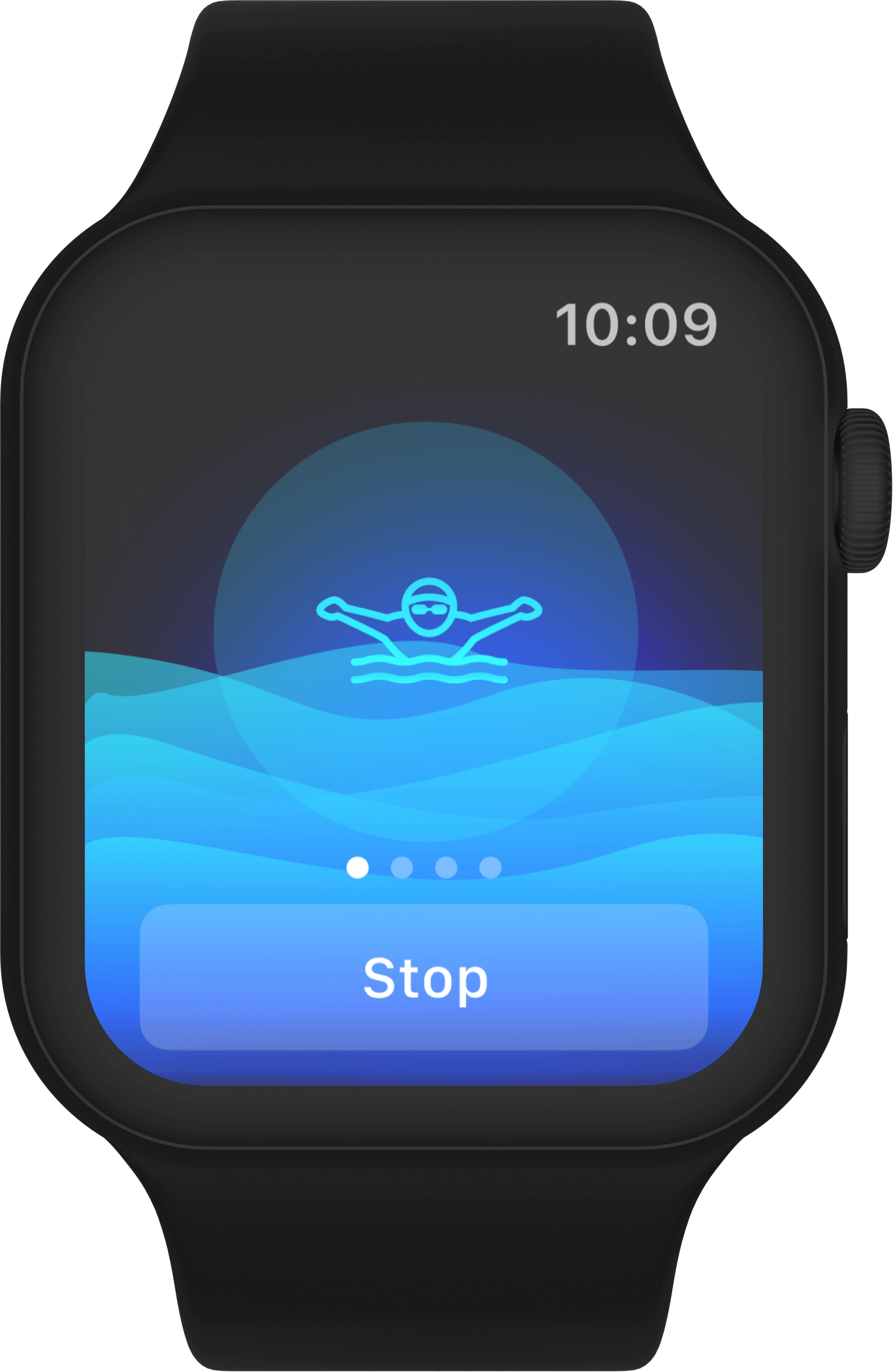
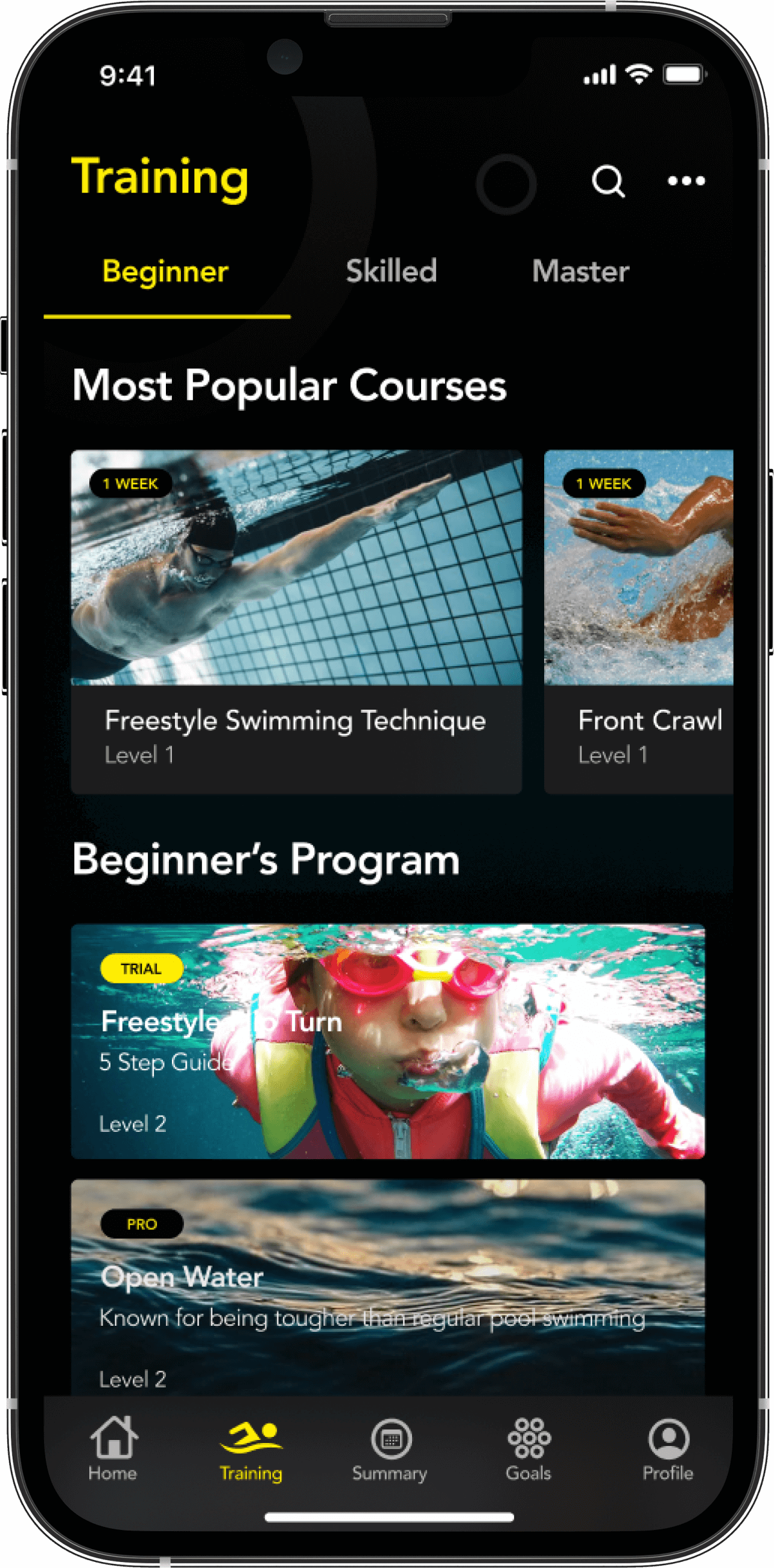
Training

We designed the UI of this section so that not only can the swimming style be programmed, but it also looks attractive to users.

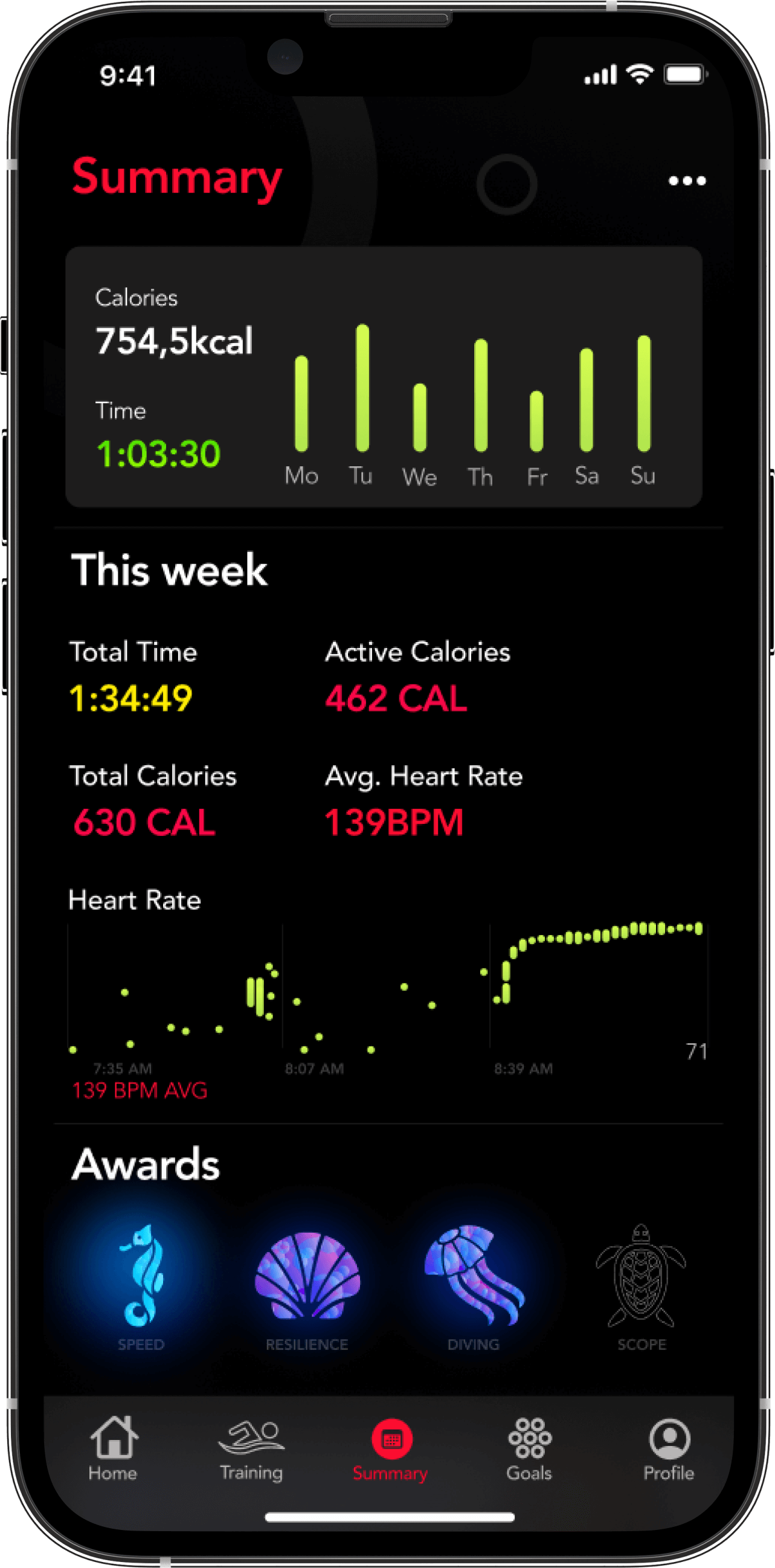
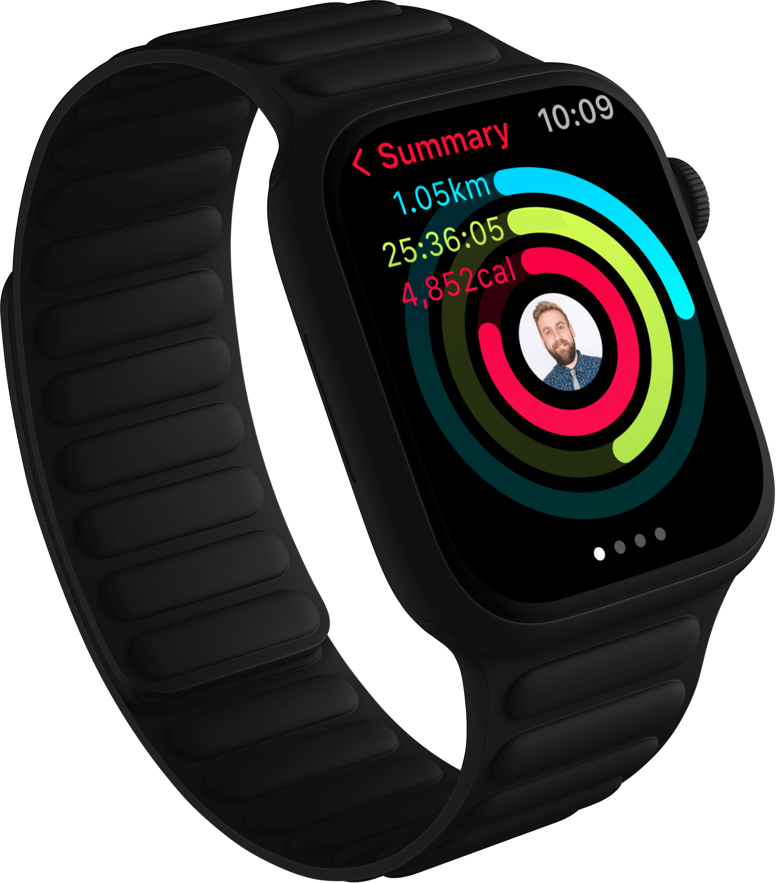
Summary

All the data that the user needs is in this section. We needed to present all the information in an orderly manner.

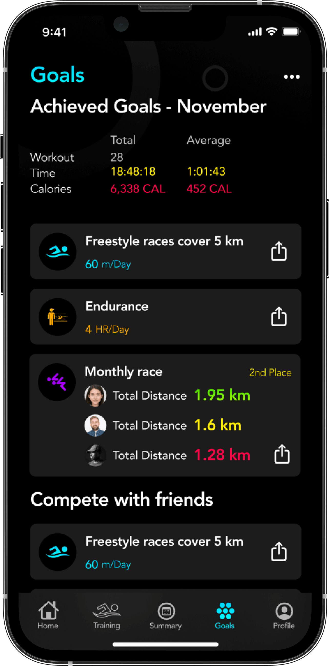
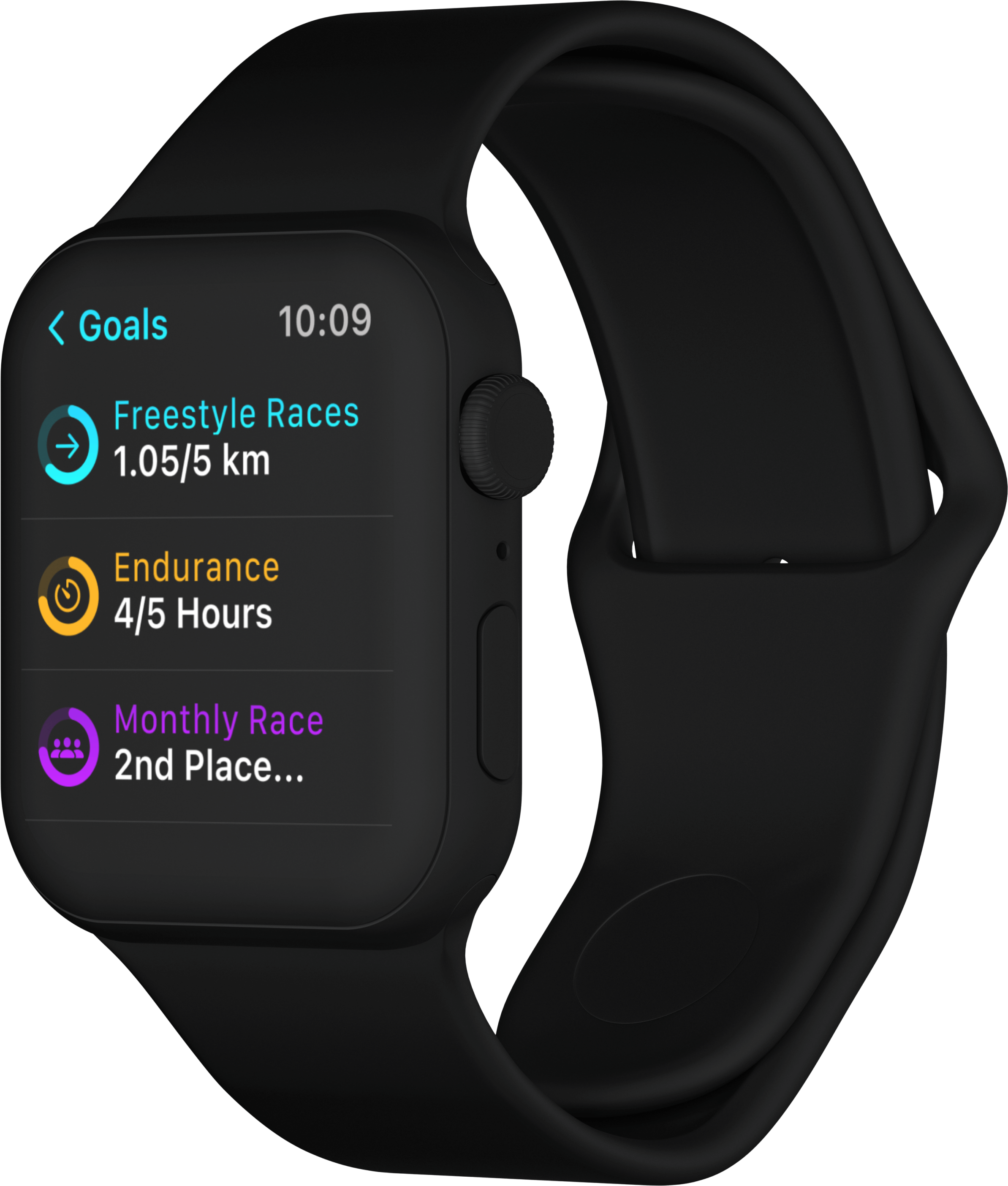
Goals

The user can archive their goals to compare their progress over time

Parcel Tracking

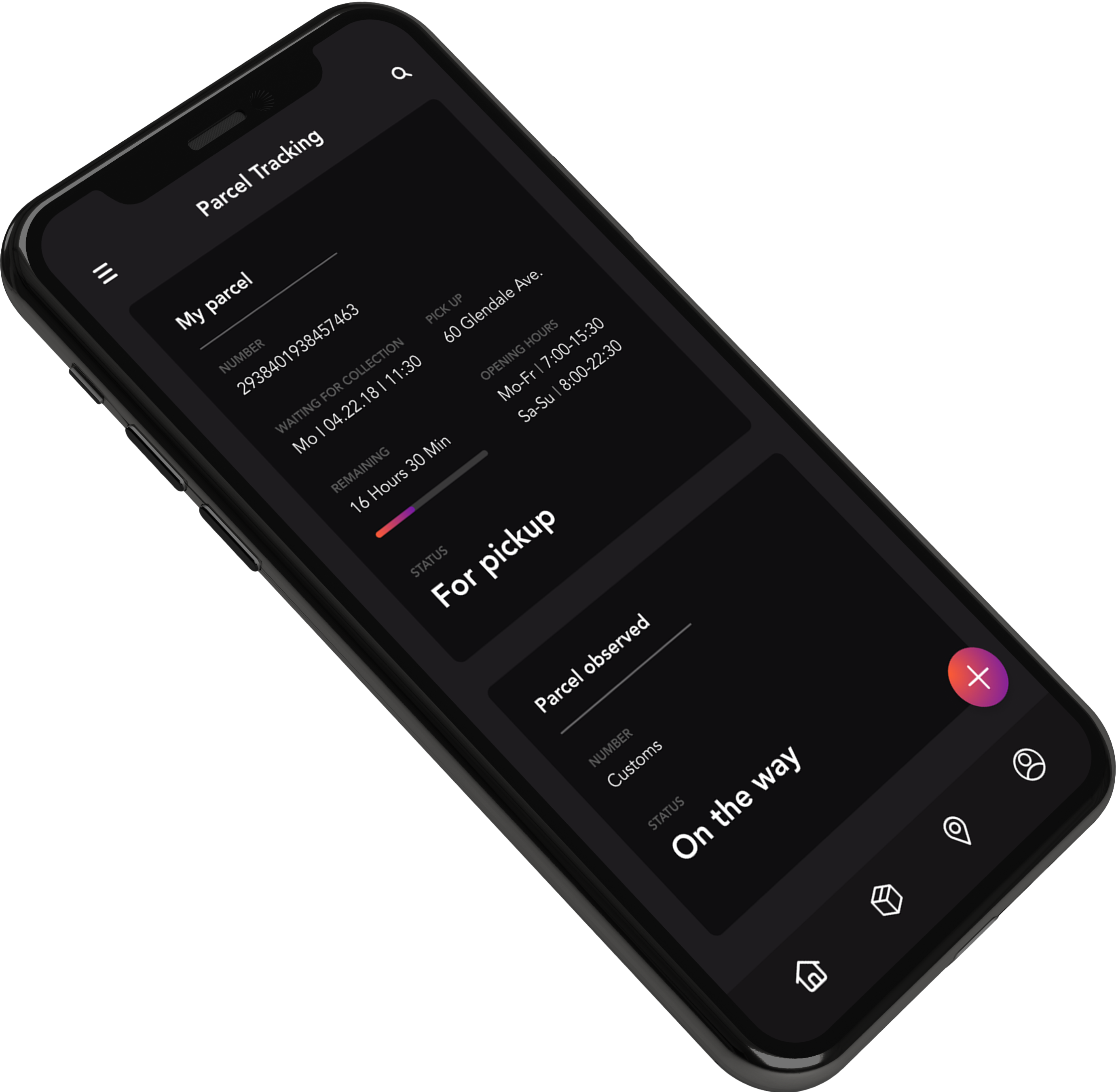
We wanted to show the most relevant information for the delivery process.

Calendar

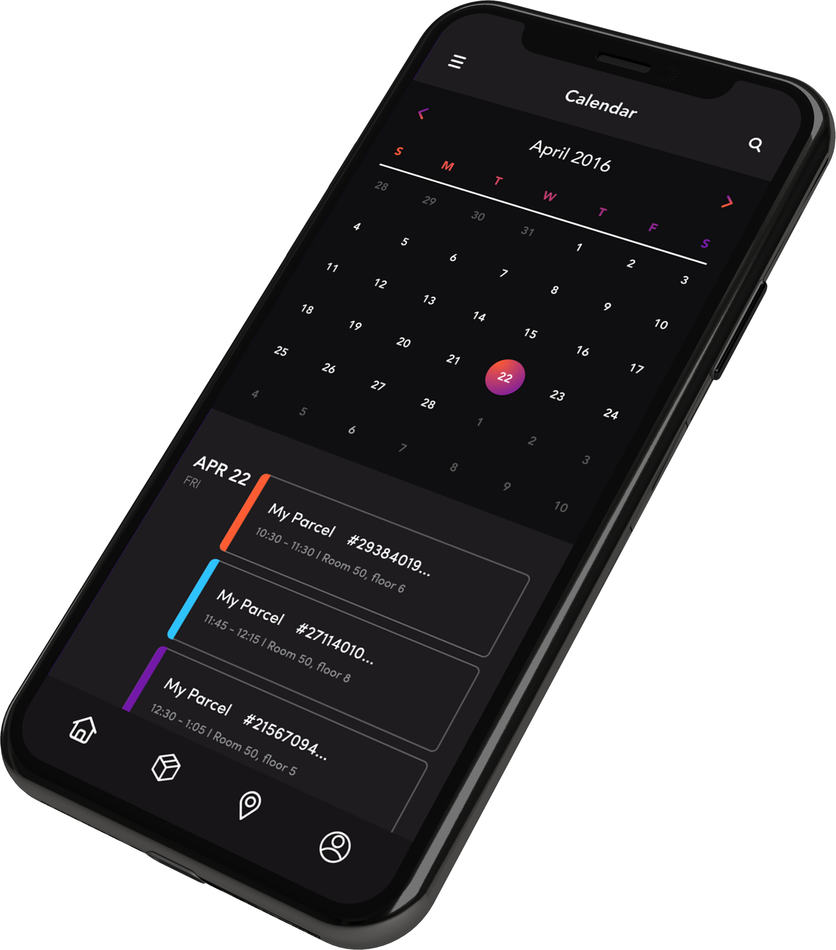
After some user testing, we understood that the user is more focused on the parcel arrival date versus how many packages they ordered, which is why we decided to use a calendar as the main screen.

Send

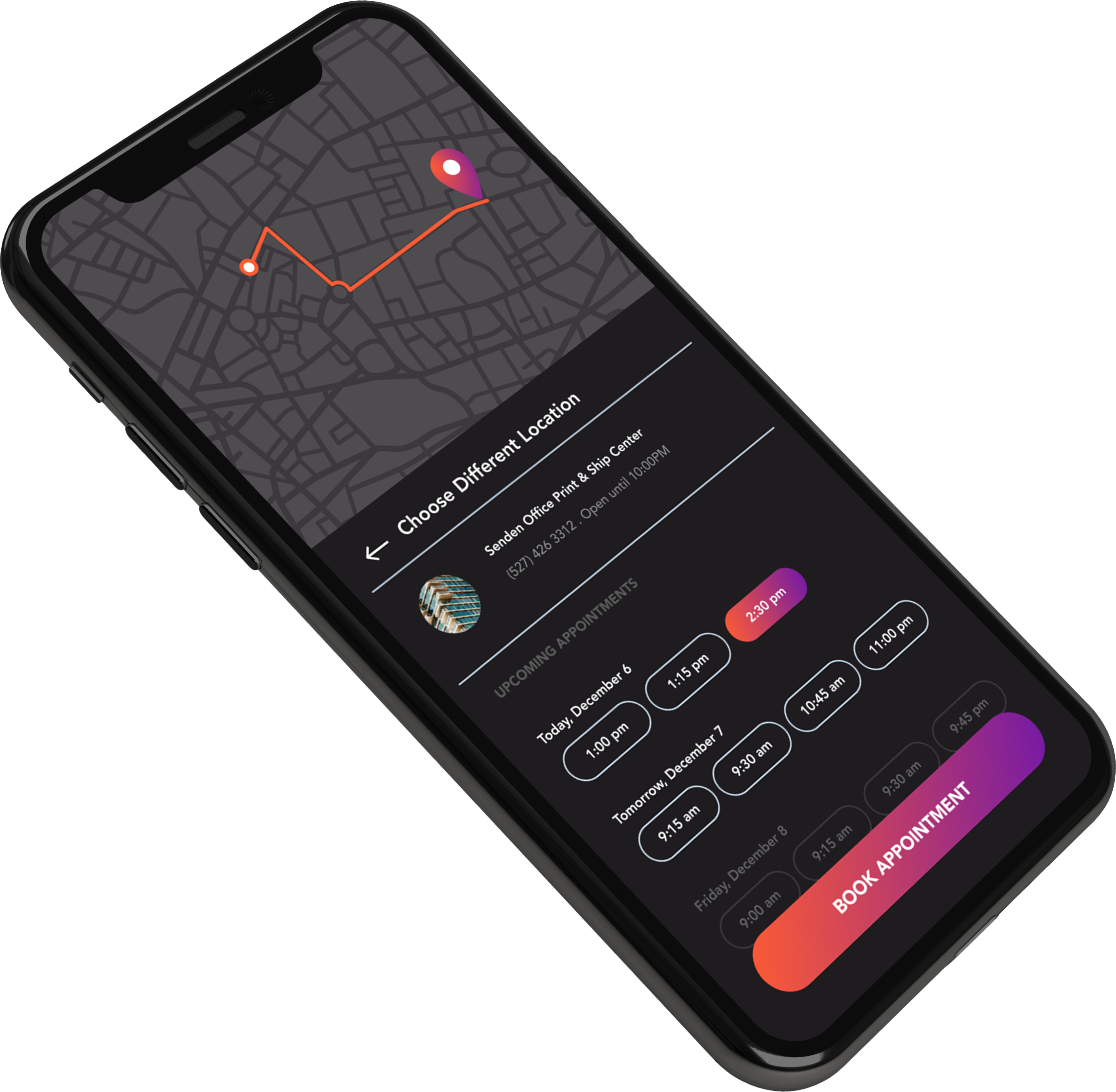
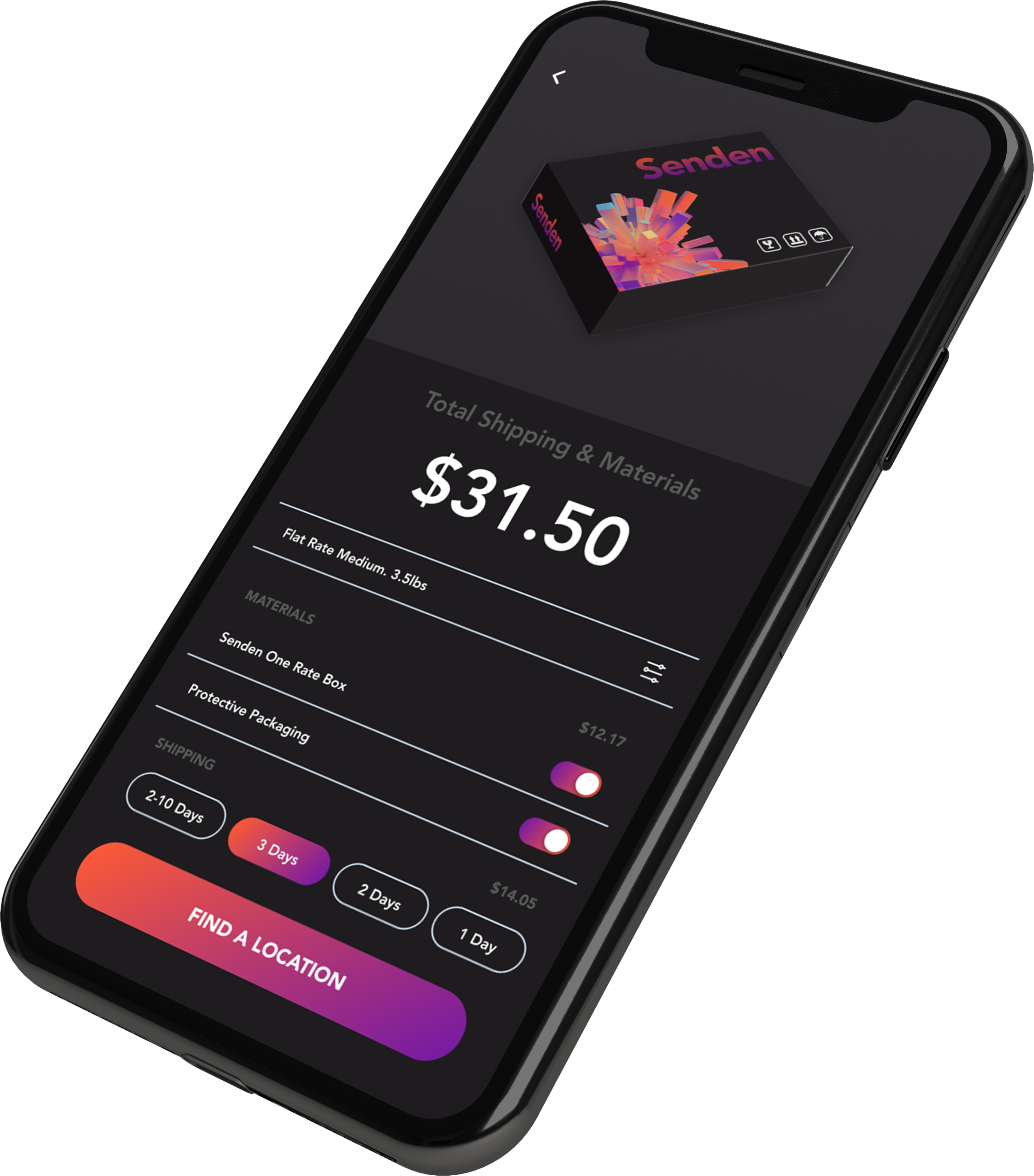
The send experience was the part where we needed to excel.

We figured out that many users don't know where they can deliver their parcels, so having a screen that shows the different delivery spots is very helpful for the end users.

Design

Having a consistent design between the app and the package improves brand recognition for the company.

Parcel Tracking

We wanted to show the most relevant information for the delivery process.

Calendar

After some user testing, we understood that the user is more focused on the parcel arrival date versus how many packages they ordered, which is why we decided to use a calendar as the main screen.

Send

The send experience was the part where we needed to excel.

We figured out that many users don't know where they can deliver their parcels, so having a screen that shows the different delivery spots is very helpful for the end users.

Design

Having a consistent design between the app and the package improves brand recognition for the company.

Brand Identity

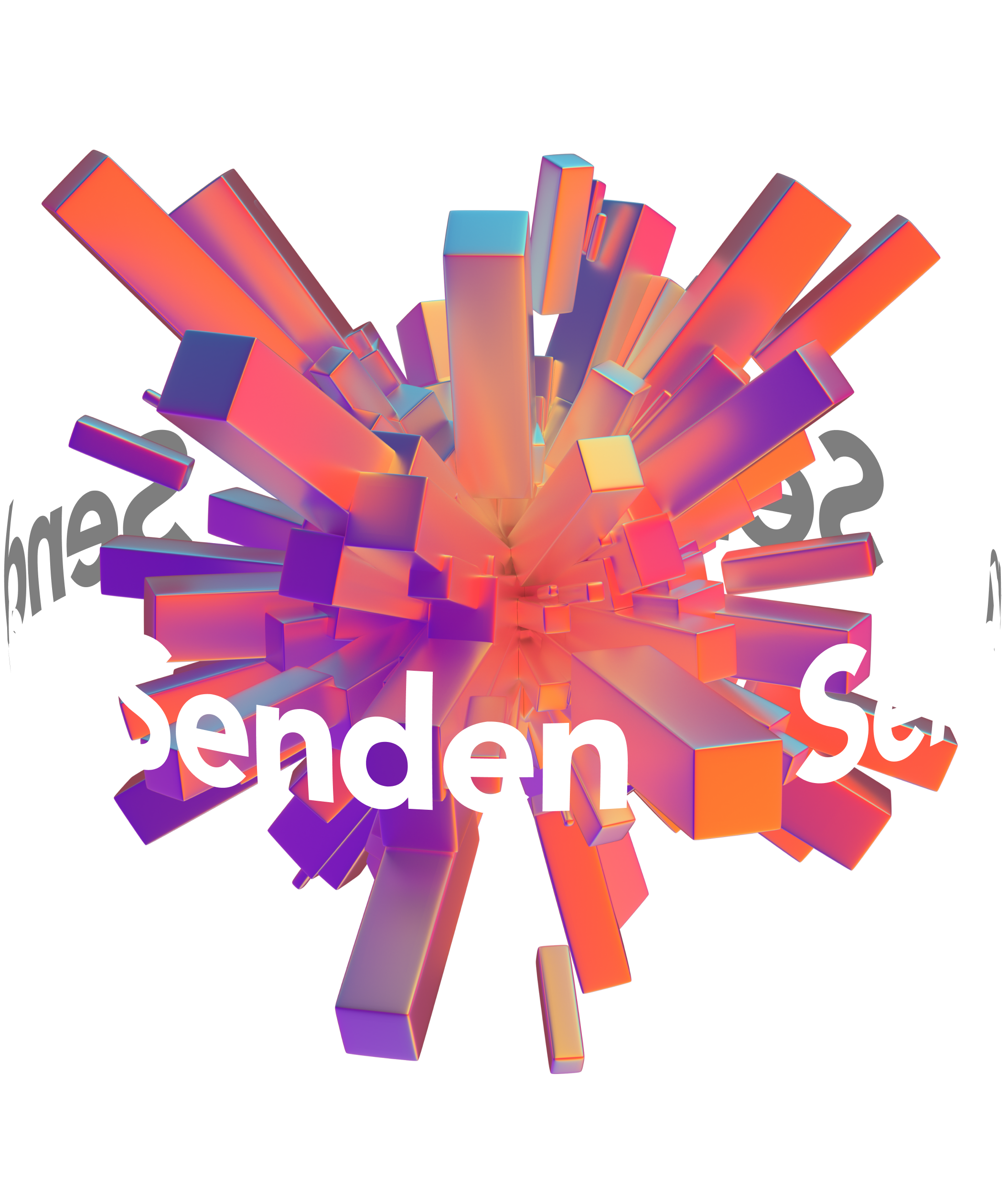
This was one of the avant-garde logos that I made. I wanted to symbolize the world with an explosion of packages. At the same time, I wanted to represent organized chaos. The logo was made in Cinema 4D.

Discover More Projects