



Product Design & Brand Identity

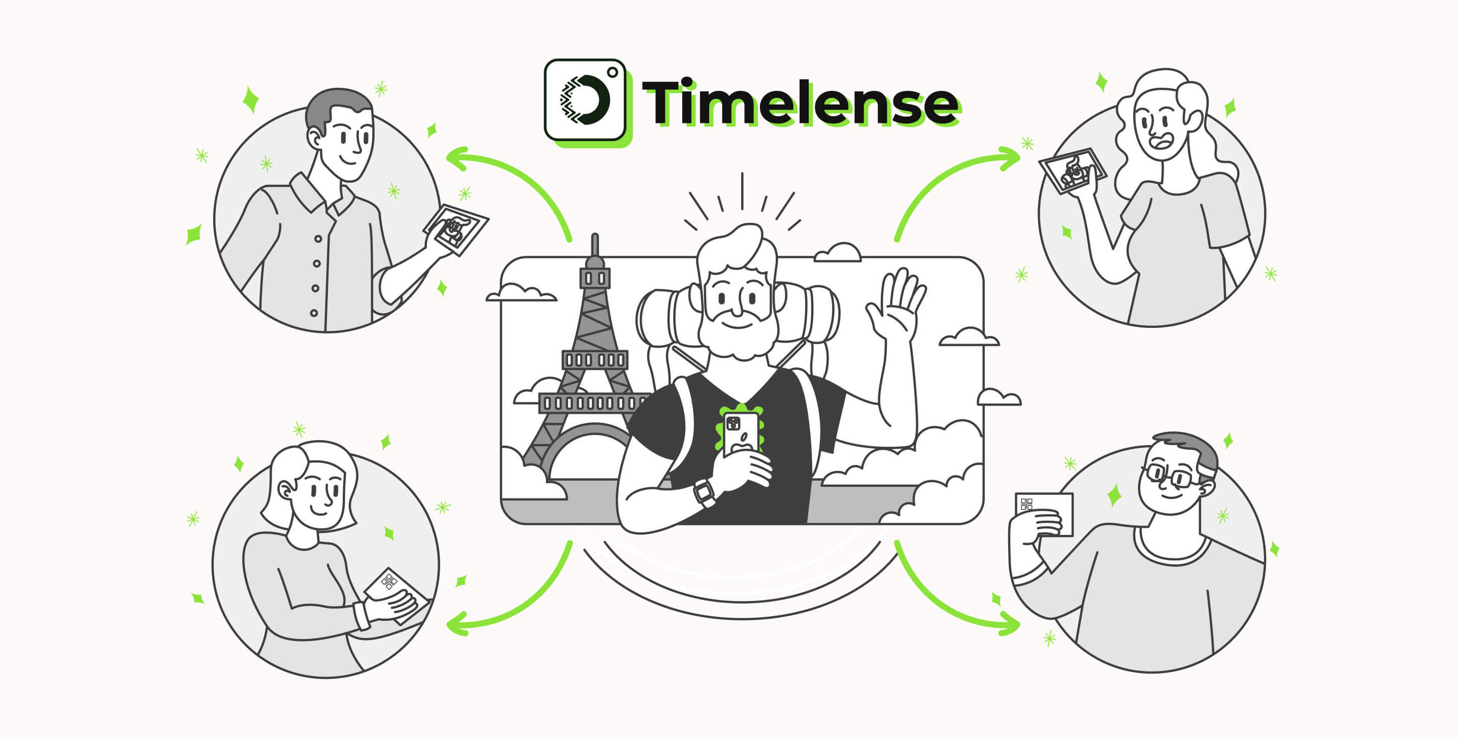
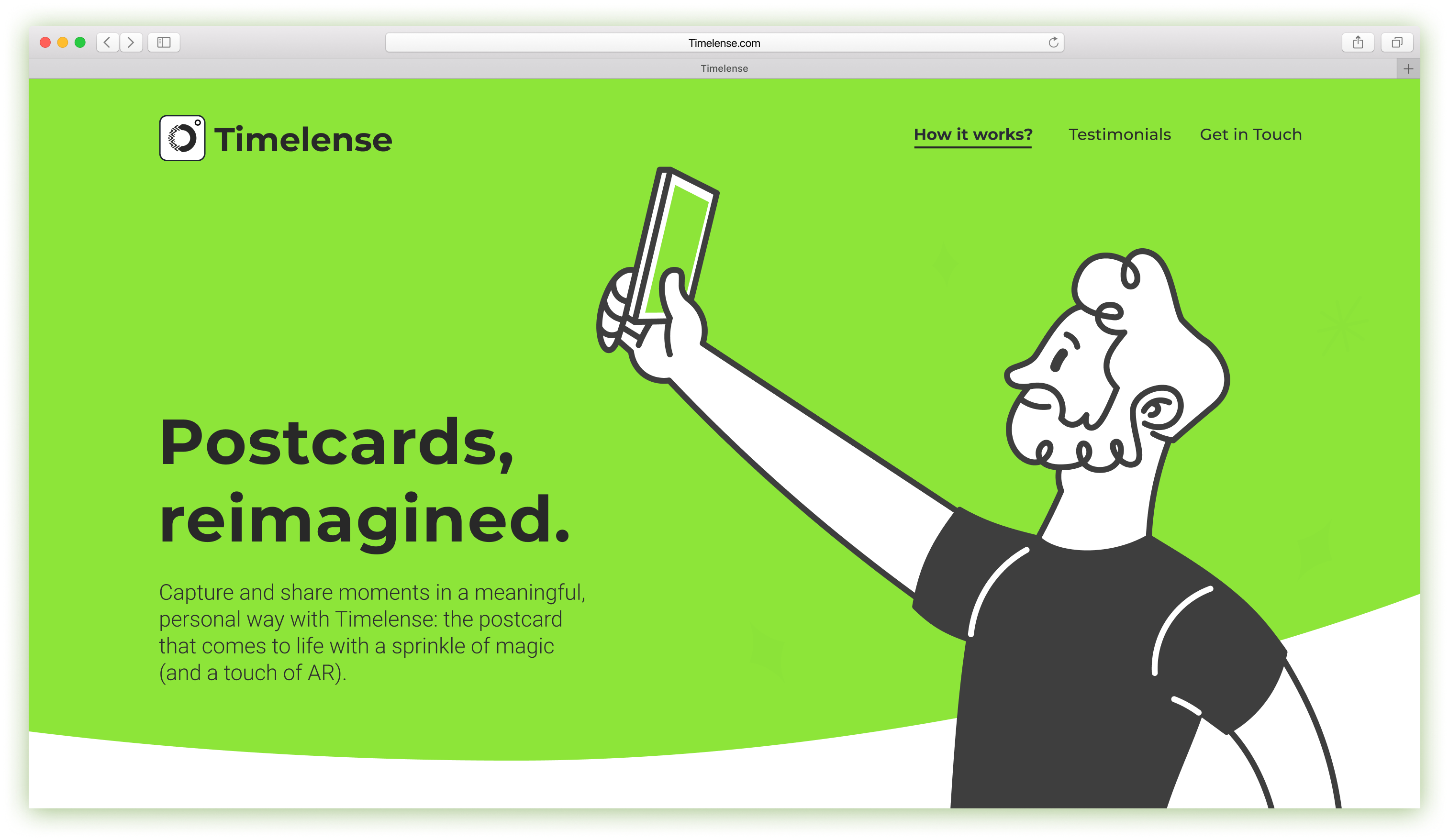
Timelense is an AR app that bridges the gap between technology and the vintage love of sending postcards. The users can use the app to create postcards, order a print version of them, and send them to their loved ones.

People love to share their pictures with their closest friends. But sometimes, they want to have the physical photo and hang it. Timelense gives users the option to print the pictures and send them to their loved ones and the possibility to enjoy more media with AR.


The logo construction was developed through an evolutionary process. Color, balance, and contrast were essential to logo creation.



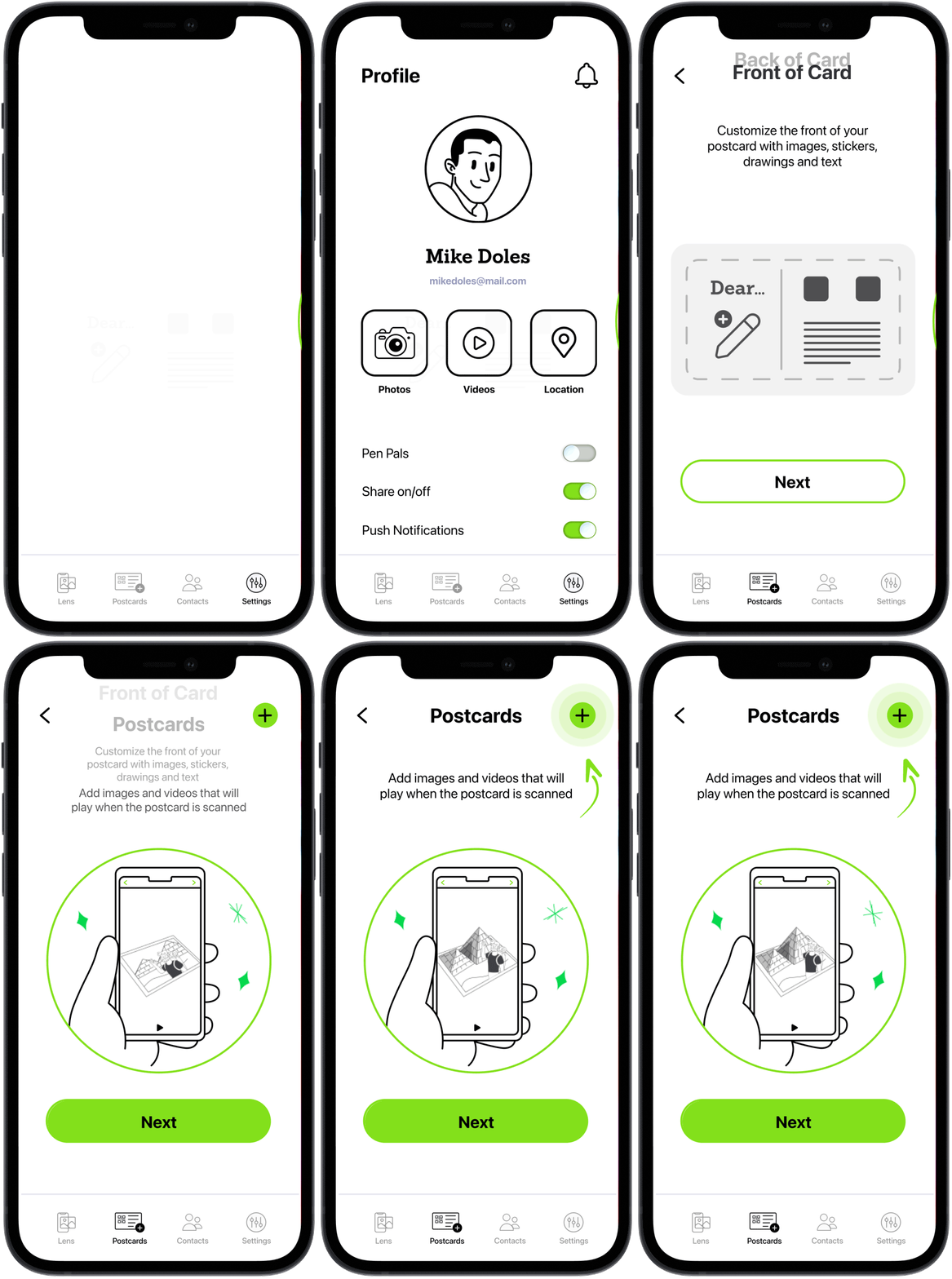
I wanted to add a little bit of realism to the design and, at the same time, a preview of what the postcard will look like.
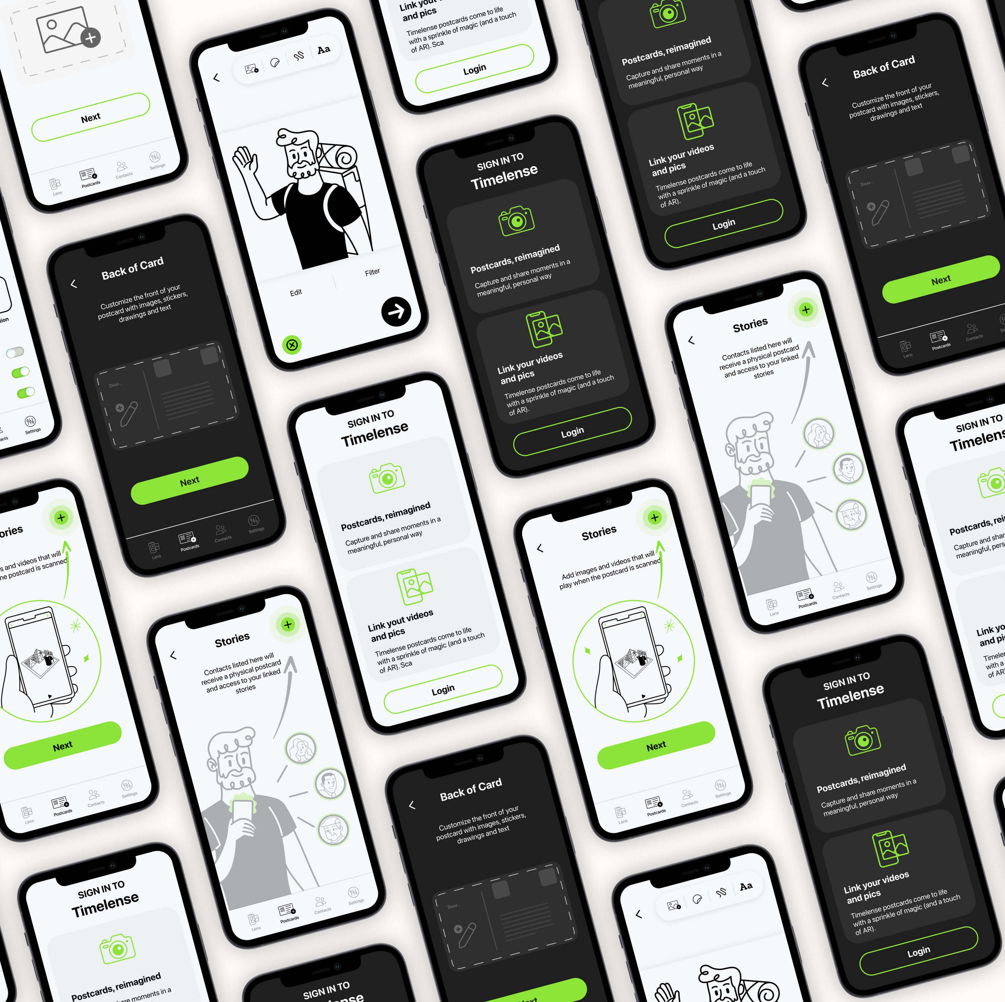
So the user can choose any photo from their library, which will be the cover of the postcard. And if the user taps on the pencil icon, the card will flip over with an animation, and they will be able to add the message to be printed on the postcard.



I created a promo video where I explain the whole flow of the app. I used different scenarios to show how a digital photo transforms into a physical postcard with AR capabilities.

I wanted to add a little bit of realism to the design and, at the same time, a preview of what the postcard will look like.
So the user can choose any photo from their library, which will be the cover of the postcard. And if the user taps on the pencil icon, the card will flip over with an animation, and they will be able to add the message to be printed on the postcard.
I wanted to add a little bit of realism to the design and, at the same time, a preview of what the postcard will look like.
So the user can choose any photo from their library, which will be the cover of the postcard. And if the user taps on the pencil icon, the card will flip over with an animation, and they will be able to add the message to be printed on the postcard.
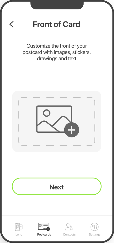
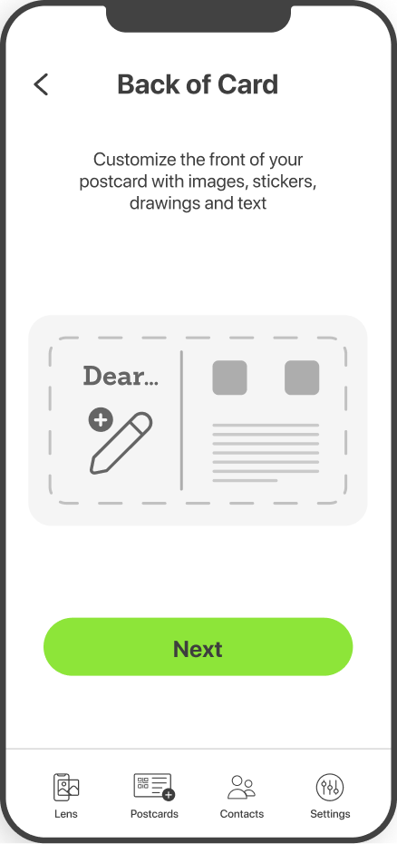
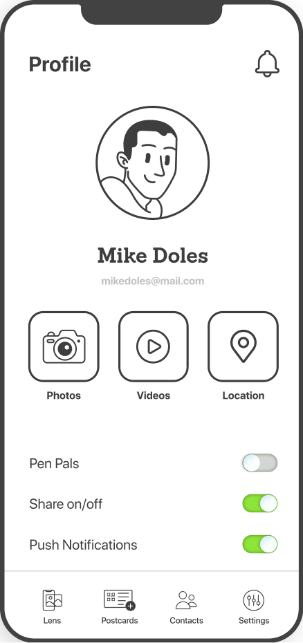
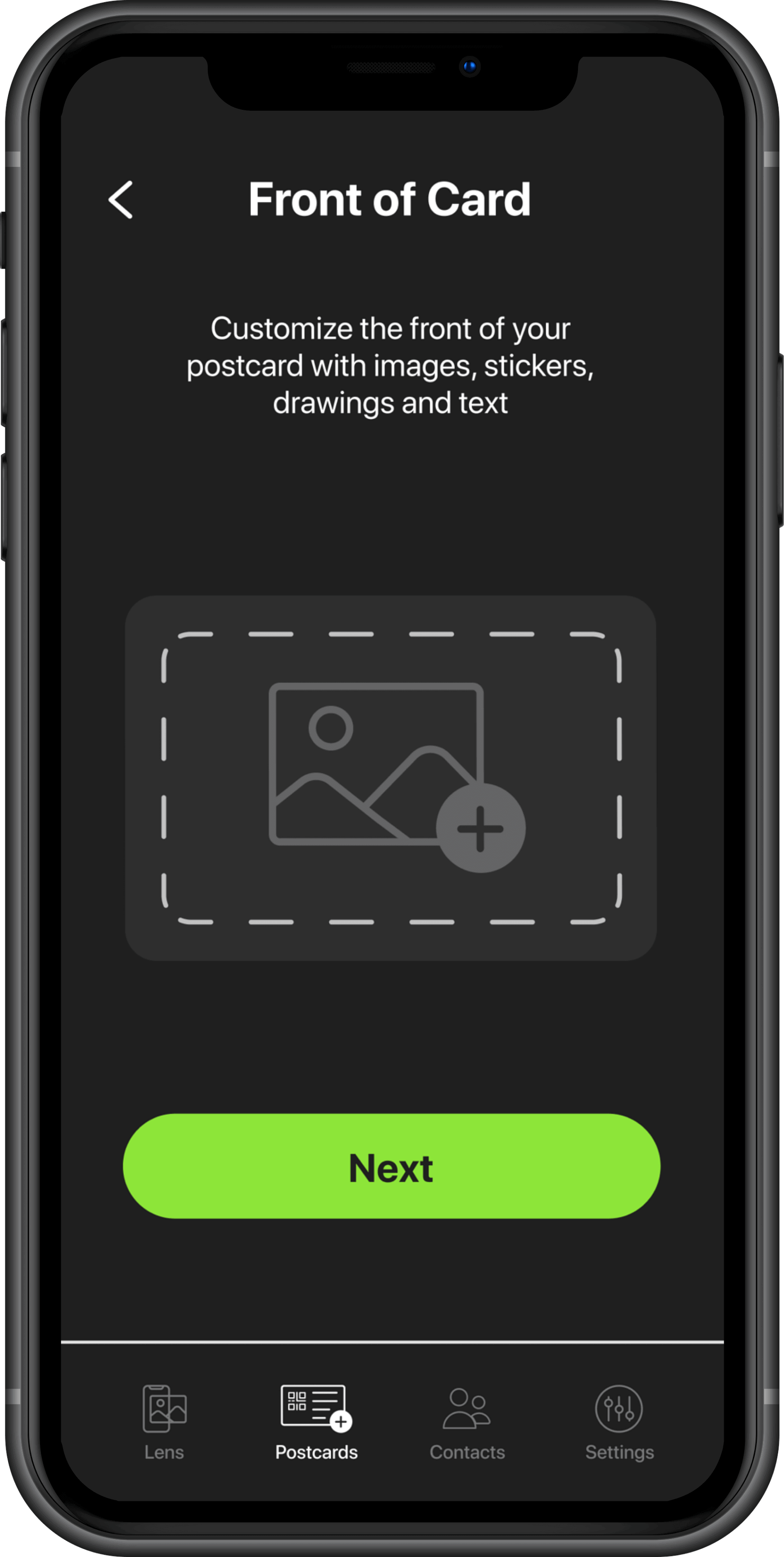
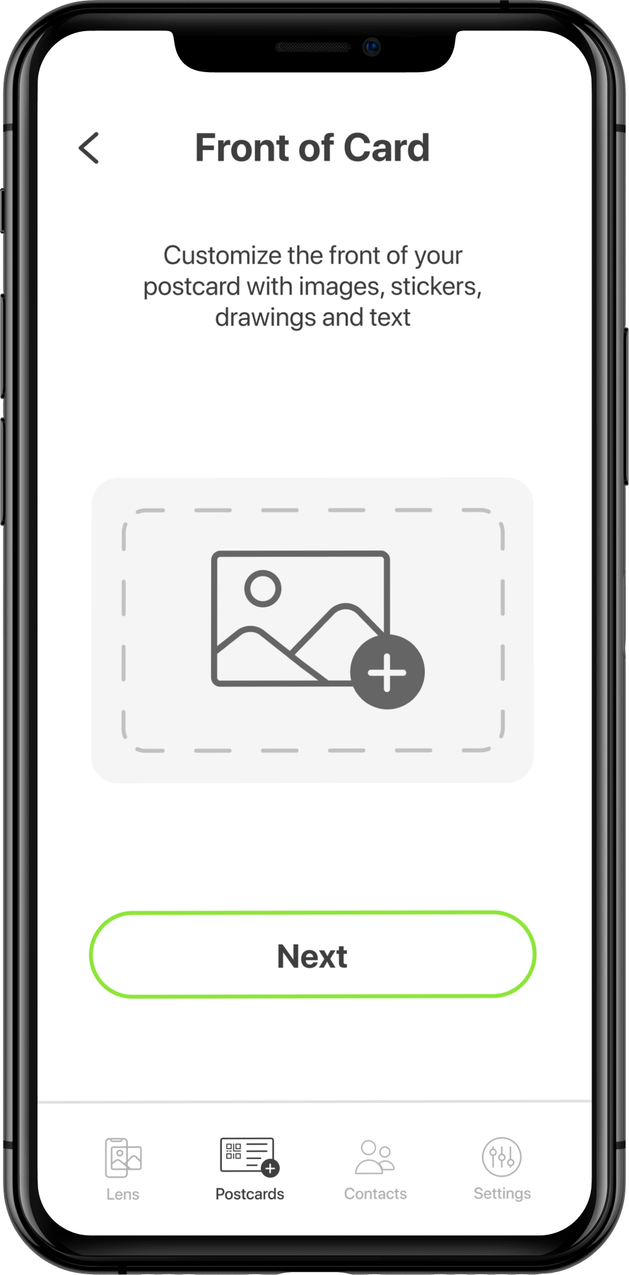
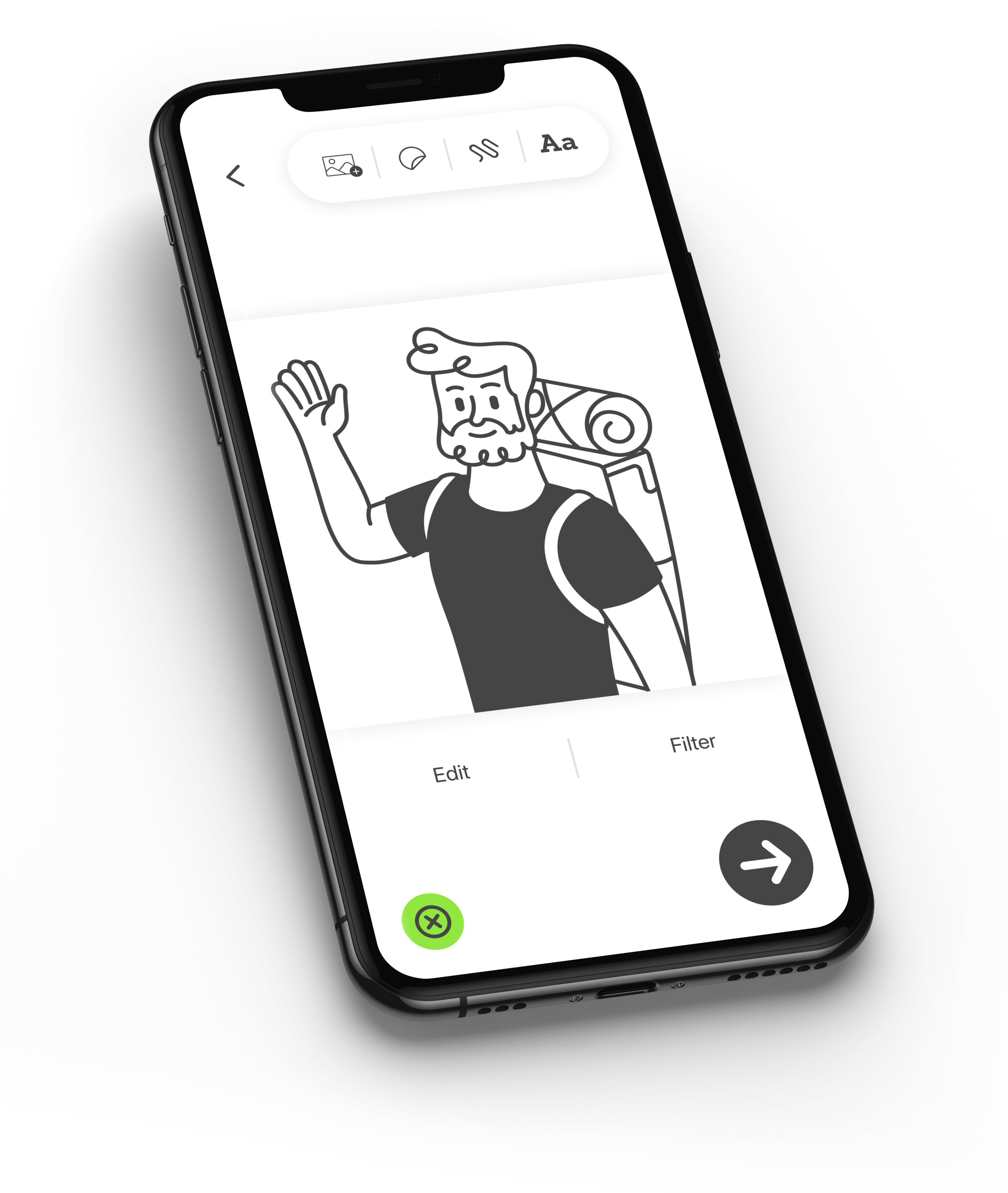
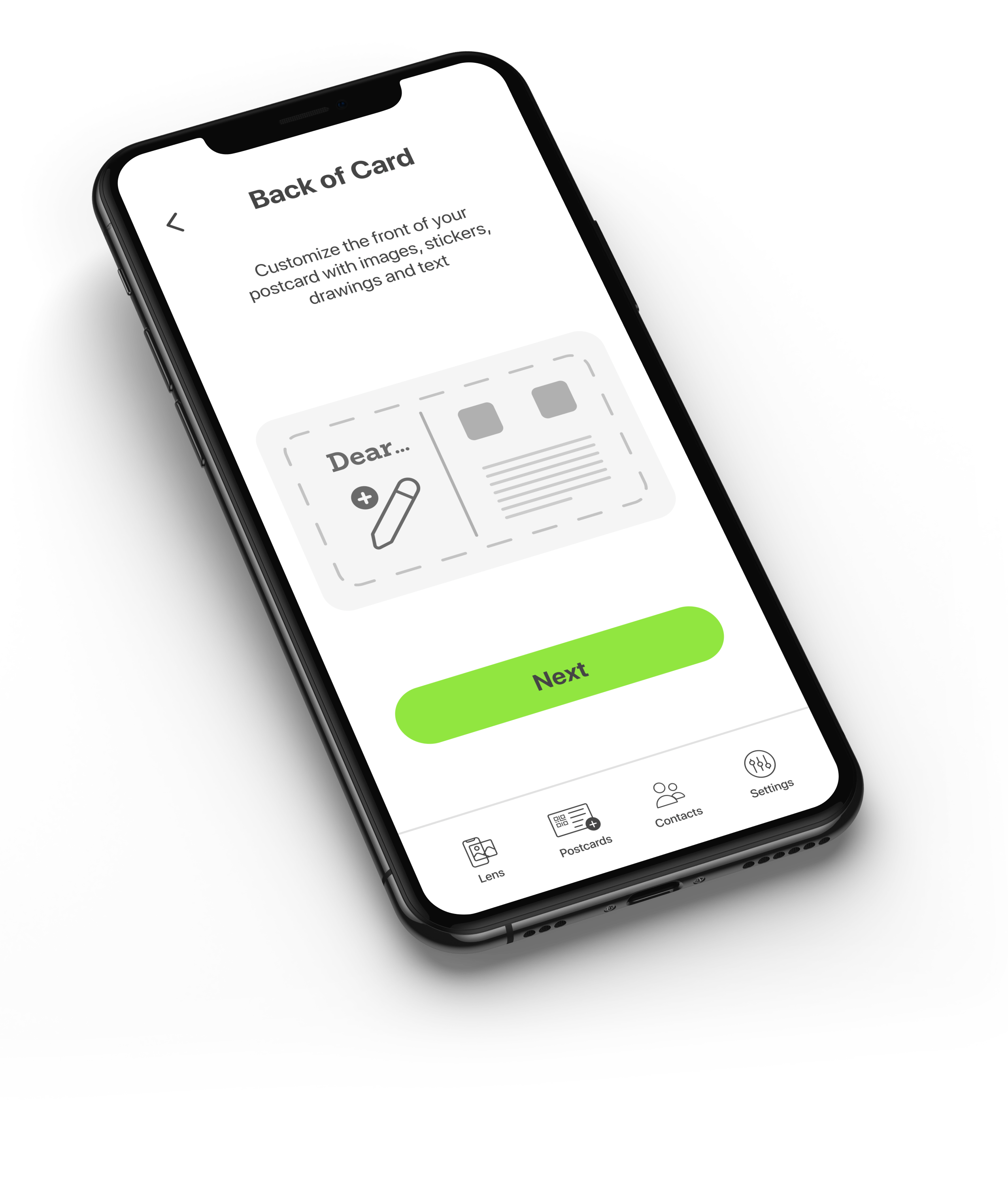
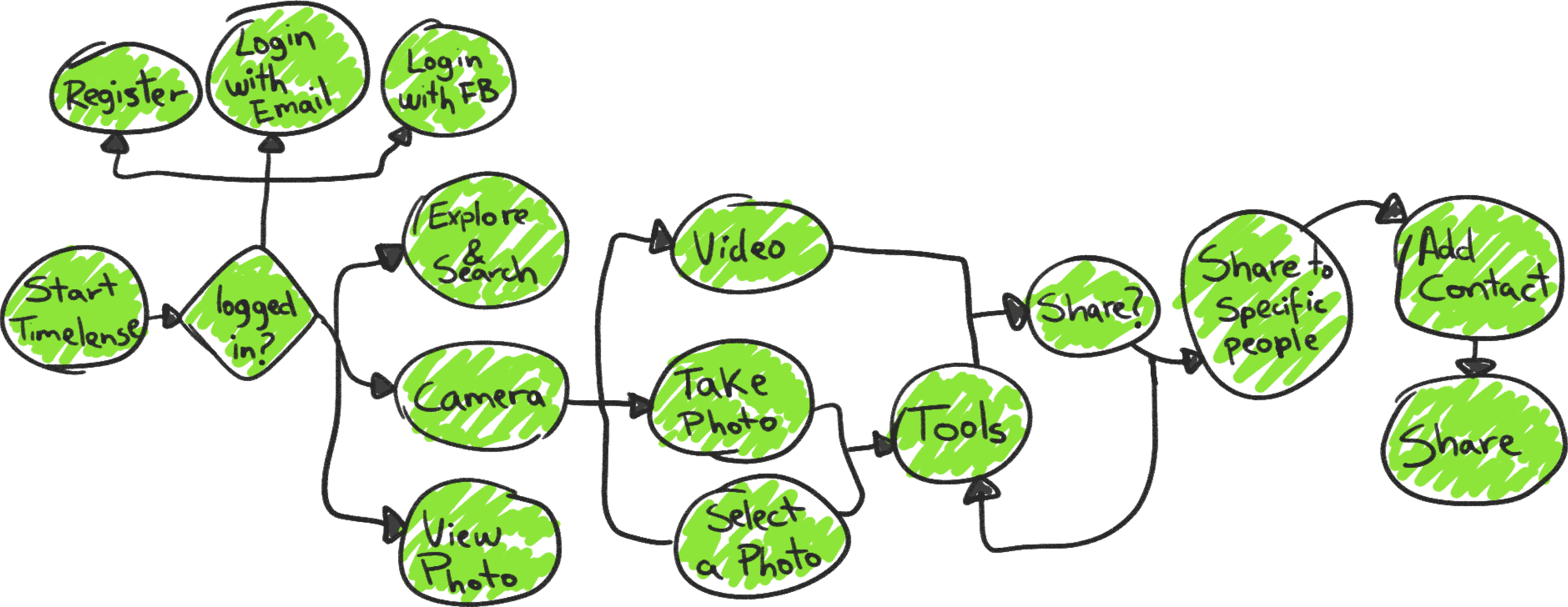
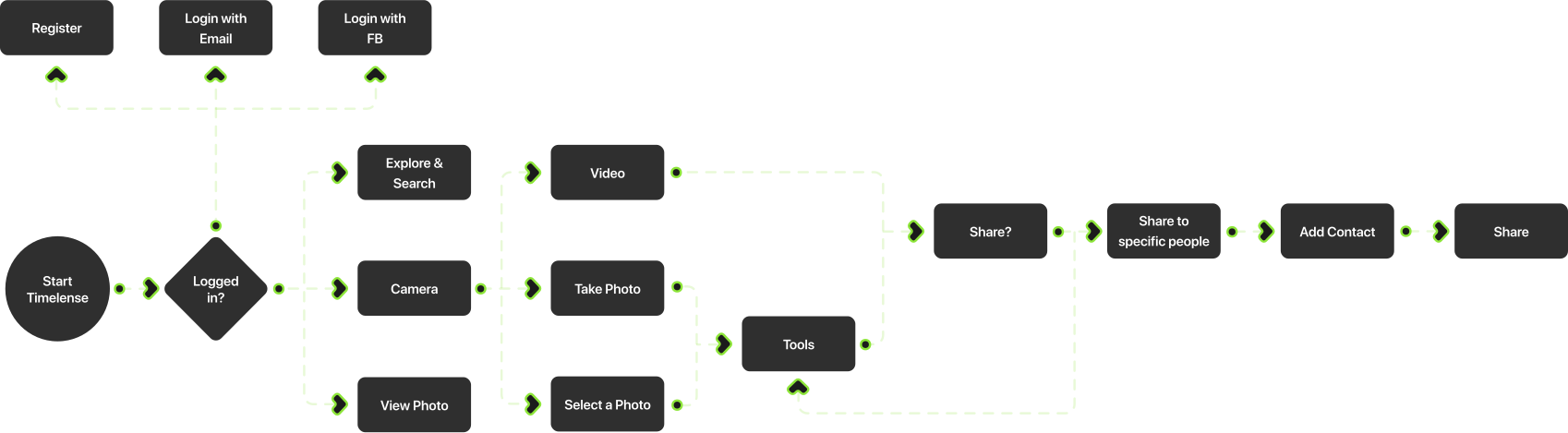
The main flow of the app focuses on creating postcards using the photo library from the app. Users can add any photo, a message on the back of the postcard, and additional media, which will be displayed in AR.